Players usually get to sign a new contract for one of two reasons:
1. Sustained increase in performance
2. Transferred to a new club
Both of these are two sides of the same coin where some kind of increased performance is rewarded either at the current club or by moving to a different club.
It’s an easy narrative to sell that a player whose contract is running down will put up good performances and try harder to secure that next payday. Whilst after they sign that contract they will try less hard as they have a secure future, and performances will drop.
Whilst that may be true in some specific cases, the integrity of the large majority of players surely wouldn’t be swayed that easily.
That’s what I’ve taken a look at here: how player performance in games leading up to their contract compared to their performance after signing the contract.
They are the top 100 contracts from the English Premier League.
Whilst the player performance measures were taken from match logs on: https://fbref.com/
Player performance is not completely described in counting stats, no matter how advanced. Context is always necessary when interpreting statistics for football performances. This analysis will take a very high level view and take a rolling average of position specific measures in matches leading up to a contract date and then the same after to compare.
Even at this high level there is context to consider. Some of the contracts are due to increased performance levels whilst others are due to transfers which would likely be the result of increased performance.
For transfers, they can only occur in the transfer windows which are either January or in Summer. So some of these will be comparing between seasons and some will be comparing within seasons, but both will be playing with different players and potentially in different roles with their new teams.
For contract extensions in the same teams, they can occur at any time and so could occur mid-season.
Performance measures for positions are as you’d expect:
For forwards they are mainly goalscoring measures
Attacking midfielders are more creative measures
Defensive midfielders are some possession and defensive measures
Central defenders are similar to defensive midfielders actually
Full backs are defensive measures and creativity.
So let’s take a look at some specific players. Below are a selection of high level players including Aubameyang, Kane, Grealish, De Bruyne, Chillwell, Wan Bisakka, Maguire. A mixture of transfers and extensions.
The first up is Aubameyang, who was the inspiration for this work. After signing a large extension with Arsenal it doesn’t feel like he’s hit the same levels as before, and the numbers suggest similar. Potentially guilty of the narrative not trying after securing the extension but more likely just a decline in performance due to age.
Next is Grealish, who has been amazing for Aston Villa, and potential transfer rumours to Man Utd. Though seems like his extension at Villa hasn’t had the same effect as Aubameyang. Arguably Grealish is even better now than before the contract. Potentially due to his age and motivation with the Euros coming up, the contract extension seems deserved.
Lastly is a transfer example with Ben Chilwell, had a great season with Leicester last year and now playing for a ‘better’ team at Chelsea. Though this whole process seems to have completely skipped Chillwell’s mind as his performances are as varied both before and after the transfer and new contract.
Now taking a look at whether contracts seem to affect some positions more than others. Each individual player’s average measure has been averaged to try to find an overall trend.
There are no clear drop offs after signing a new contract. Most of the time immediately before the contract seems to be the worst performances and they seem to pick it up afterwards. Perhaps contract talks have a negative effect on player performances from a mental perspective.
Arguably forwards have the sharpest drop in performance leading up to contracts, and whilst their performance does increase. It’s not certain they’ll return to pre-contract levels.
Forwards’ performance measures are largely affected by goalscoring, which is pretty lucky in itself. The players getting new contract and transfers are those that are likely to be performing well leading up to their contract or transfer. This likely includes some hot goalscoring streaks and over-performing which will be hard to replicate going forwards.
And finally taking a look at all positions together, to try to get an overall view at player performances before and after signing contracts.
It seems that there’s a drop in performance leading up to the contract and then it picks back up afterwards.
This is largely driven by the high pre-contract performances of forwards as discussed earlier. With the remaining positions not as large a difference.
As mentioned multiple times, this sample of players is implicitly biased towards players who have performed well before signing contracts, especially large ones. If looking at all contracts across all leagues and taking into account the contract monetary amount there may be further patterns to find.
But in this sample we seem to be seeing a slight drop in performance leading up to contracts and then a return to mostly similar levels afterwards. There is the inevitable regression to the mean argument which is applicable across all positions. It’s largely affecting positions and players that rely on more variable performance measures like goalscoring rather than midfielders or defenders whose measures include higher volume measures such as touches or passes.
The secondary Ozil assist that penetrates the defence is the one that actually creates the goal scoring opportunity, even though Kolasinac is the one credited with the assist and Aubameyang actually scores the goal.
Expected threat can attribute a proportion of the goal contribution to Ozil’s pass as well as Kolasinac’s assist which is great.
Even if there isn’t a shot at the end of the play, expected threat is assigned to all locations on the pitch so you can see how valued it is.
Specifically, you can quantify the threat of each action by working out the difference in expected threat at the start and end of the action. If it increases, then you’re more likely to score in the next few actions than previously which is good.
How this solves the problem.
If a player has a great chance to shoot but doesn’t, there is no recording of this under traditional metrics.
Using expected threat, the quantified threat at that location could be attributed to that possession. So even though there was no shot, there is still some value attributed to getting in a good position to score.
Across all possessions in a match, each team will get into threatening positions and sometimes shoot, sometimes not.
If they shoot, then great we can count the shot and assign it an expected goal value. If they don’t, then we can assign that possession the highest expected threat value achieved in that possession.
This way, all possessions are worth something and reflect the intuition that a goal could happen on any given possession but sometimes things just don’t fall exactly right.
A Simplistic Approach
Now I would like to use expected threat values, but haven’t created my own expected threat model yet.
I have created a simple expected goals model for this and will use it as an approximate to the type of concept that expected threat more rigorously develops.
Expected threat is calculated through iterations of solving what a player is likely to do from each position and each subsequent iteration works out what they can do in subsequent actions.
An expected threat model with a single iteration is considered an expected goal model, so approximates expected threat. It assumes that a player can only shoot from all areas of the pitch and what the likelihood is of scoring from there, as opposed to considering moving or passing to other locations as well.
What I’ve done:
1. Using StatsBomb event data with shot freeze frames to train a logistic regression model to predict the probability of scoring a goal considering distance from goal, angle of goal available, number of defenders blocking the goal and the distance to the closest defender.
def calculate_xG(shot):
    ''' calculate_xG (shot)
    Calculates the Expected Goals based on a model trained using StatsBomb event and freeze frame data.
    Input is a row of a dataframe with columns for distance, angle, distance_nearest_defender, number_blocking_defenders
    '''
    # For the model, get the intercept
    intercept=1.0519
    # For as many variables as put in the model,
    # bsum = intercept + (coefficient * variable value)
    bsum=intercept + 0.1080*shot['distance'] - 1.6109*shot['angle'] -
    0.1242*shot['distance_nearest_defender'] + 0.3260*shot['number_blocking_defenders']
    # Calculate probability of goal as 1 / 1 + exp(model output)
    xG = 1/(1+np.exp(bsum))
    return xG
The above model is by no means the best (or even close). But using StatsBomb’s freezeframe event data for shots let’s you build a model that can use defender location information which is great for this concept.
2. Using Metrica’s sample tracking data (match 2), calculated the expected goal for all frames of the game. Creating necessary features using locations of ball and nearest players on the pitch for both the home and away team.
3. It’s only physically possible for an attacking player to shoot if they have the ball, so have created a new non-shot xG for those frames where the ball is within a certain distance of an attacking player.
Note: this is approximating an attacking player being in control of the ball, but also picks up frames where the ball flies past a player from a cross or an attacker walks past the goalkeeper holding the ball.
x-axis: Time (s), y-axis: Expected Goals. Home team scores a goal. Expected goal (red) and non-shot expected goals (green) are tracked on time series below. When a shot is taken, they are the same thing.
4. Metrica define possessions as per their documentation. For each possession, if it ended in a shot, then take the xG of that shot, otherwise take the highest xG_available to approximate the non-shot quality of the possession.
x-axis: Time (s), y-axis: Expected Goals. Home team gets into the opponent’s penalty area, but misplaces the cross and turns over possession.
Non-shot expected goals are NOT designed to suggest that the above red player should have shot rather than trying to cross for a better opportunity to shoot. They are useful to track the quality of possessions where there is no alternative. The above possession doesn’t count in any traditional metrics because no shots were taken, but perhaps should be tracked somewhere.
5. Totalled all the traditional game statistics including shot xG and the new non-shot xG which are below.
Home
Away
Goals
3
2
Shots
13
11
Expected Goals
2.04
2.02
Non-Shot Expected Goals
5.31
3.46
Passes
543
421
Possessions
147
136
Post match box score for Metrica Sample Game 2
Discussion
As you can see, the non-shot xG is always higher than the standard xG since it includes xG and in addition, the quality of the possessions without shots. A measure for how ‘wasteful’ a team was would be to look at the difference.
A much higher non-shot xG than xG would suggest the team got into quality shooting positions frequently but didn’t take advantage and take the shots.
A more similar non-shot xG and xG would suggest the team made the most of their shooting positions by taking the shot.
Again, using the simplistic xG model here is an approximation for something more sophisticated like expected threat. But I think it nicely highlights the distinction and what’s missing when only relying on goals, shots and expected goals to review how a team performed in a match solely from the box score.
There are some notebooks and code alongside this that I’ve put on GitHub, do check it out if you’d like! Feel free to ask questions or comment over at @TLMAnalytics.
The inspiration to this discussion came from the Tottenham v Arsenal match last weekend, where Arsenal heavily domianted possession (68% v 32%), shots (12 v 6) and sent in 34 crosses. Despite seemingly dominating the on ball metrics and appearing to have been unlucky to come away losing 2-0 if you only looked at the post-game stats, watching the game tells a different story. Are there any ways of measuring the dominance of a match and do they require the ball?
Arsenal didn’t ever really seem like scoring and Spurs didn’t ever really feel under threat of conceding. It’s worth mentioning here that for the majority of the game Spurs were winning after scoring with their first open play shot, which means that Spurs didn’t need to overextend themselves. From then on the responsibility for trying to attack fell to Arsenal, whilst Spurs could soak up pressure and hit on the counter if they so choose. Which they of course did.
Spurs had a game plan and their intentions were clear, they also executed this game plan extremely well appearing comfortable the whole game. Arsenal maybe had a game plan and their intentions were not so clear, it’s not clear if they executed it and arguably they did not since they lost the game whilst appearing desperate. Intent or execution of intent are potential candidates for measuring dominance.
So in this particular match it seems the difference was the defending team had a game plan, executed it and so were comfortable. This is different to a potentially similar scenario where a possession heavy team is creating lots of chances and seems to score at a will. Think Manchester City, Barcelona or Bayern Munich against lower skilled opposition. They have a game plan, execute it and are comfortable when they’re playing at their best.
This highlights the distinction between traditional box-score statistical dominance and the eye test. Controlling the ball doesn’t mean you are controlling the match, rather it’s the control of space on the pitch and particularly the areas of importance.
For example without the ball:
Spurs were winning
The only way they would lose is by letting Arsenal create chances
That’s most likely if Arsenal get the ball near Spurs’ penalty area
So Spurs decided not to let them do that (very successfully)
Or with the ball:
Barcelona are controlling possession and are actively trying to score
Perhaps to go ahead or increase their lead
They need to create chances
To do so they need to get control of the ball near the opponent’s area
Both scenarios end up with the team that can control the area on the pitch they want to seemingly dominating the game.
I feel like a flow chart would be appropriate, something like this makes sense. There are lots of options I haven’t put here since I just wanted to get the main point across. And the word dominant is used optimistically here, there are of course exceptions to everything in specific circumstances.
Arsenal:
Do you want the ball? YES
Can you get the ball? YES
Do you want to score? YES
Can you create chances? NO
Not dominant
Spurs:
Do you want the ball? NO
Are you conceding chances? NO
Dominant
In terms of quantifying this match dominance, the questions in the flow chart roughly correspond to existing metrics.
Do you want the ball? Gamestate and style dependent (Eg. winning, losing or drawing and possession/counter attack)
Can you get the ball? Gamestate, style and possession dependent (Eg. pressures by area of the pitch and passes completed, attempted)
Do you want to score? Gamestate dependent (Eg. winning, losing or drawing)
Can you create chances? Gamestate, style and space dependent (Eg. chances created, xG, shots, passes into the penalty area)
Are you conceding chances? Gamestate, style and space dependent (Eg. chances conceded, xGA, shots against, passes conceded into own penalty area)
Notice all of these questions are gamestate dependent, which shows how important it is. Gamestate usually leads the game plan of a team, if you’re losing you want to score and if you’re winning you want to not concede. Gamestate is easy to quantify, so could be used as an approximation for intent or combined with a style metric to further outline what a suggested game plan for a team would be in a particular scenario.
The other dependencies involve possession, space and style. Possession could be important, but not on its own. Pitch control models are great at understanding which team controls which area of the pitch at any given point of a match. You could go a step further and introduce a possession quality weighting to create an possession value model, which would reward control of the pitch closer to areas of importance.
Combining these two together would involve creating a time series of a match that weights the pitch control model or possession value model of each part of the match by the gamestate. For example, if you are winning, then the possession value of the ball near the opponent’s goal isn’t so high since you don’t need to score. If you are losing then the possession value in the opponent’s half is much higher, as you need to generate chances to get back into the game.
This is a really long way of saying that if you can execute your gameplan successfully and comfortably, arguably you are the dominant team in that period of the match. And just because you have the ball a lot, if you can’t do anything with it then it’s not that great, I’m sure we can all agree there.
Arsenal’s Invincibles season is unique to the Premier League, they are the only team that has gone a complete 38 game season without losing. They’re considered to be one of the best teams ever to play in the Premier League. Going a whole season without losing suggests they were at least decent at defending, to reduce or completely remove bad luck from ruining their perfect record. This project aims to look into how Arsenal’s defence managed this. To do so training a model is not necessary as this is a descriptive task, not a predictive one. Instead, I will focus on answering the questions with data visualisations to effectively represent and communicate the answers to the questions.
Problem Statement
The goal is to identify areas of Arsenal’s defensive strengths and the frequent approaches used by opponents. Tasks involved are as follows:
Download and preprocess StatsBomb’s event data.
Explore and visualise Arsenal’s defensive actions.
Explore and visualise Opponent’s ball progression by thirds.
Cluster and evaluate Opponent’s ball progressions using several clustering methods.
Visualise clustering results to aid understanding.
Cluster and evaluate Opponent’s shot creations using several clustering methods.
Visualise clustering results to aid understanding
Dataset Decsription
Using StatsBomb’s public event data for the Arsenal 03/04 season* (33 games), I take a look at where Arsenal’s defensive actions take place and how opponents attempted to progress the ball and create chances against them.
There are 112,773 rows and 161 columns in the data. Each row is an event from a game that has a unique id, timestamp, team, player and event information such as type and location. We will not need all events as we will filter for only defensive event types and then separately for ball progressions from Arsenal’s opponents.
There are 10251 Arsenal defensive events and 12077 opponent ball progression events. Example rows of each dataset are below:
Metrics
To determine the appropriate number of clusters for K-Means and distance threshold for Agglomerative clustering, the below metrics are used. They try to consider the density of points within clusters and between clusters.
Sum of squares within cluster:
Calculated using the inertia_ attribute of the k-means class, to compute the sum of squared distances of samples to their closest cluster center. Lower scores for more dense clusters.
Known as the Variance Ratio Criterion, defined as the ratio between within-cluster dispersion and between-cluster dispersion. Higher scores signal clusters are dense and well separated.
Average similarity measure of each cluster with its most similar cluster, where similarity is the ratio of within-cluster distances to between-cluster distances. Minimum score is 0, lower values for better clusters.
StatsBomb collect event data for lots of football matches and have made freely available a selection of matches (including all FAWSL) to allow amateur projects to be able to take place. All they ask is to sign up to their StatsBomb Public Data User Agreement here: https://statsbomb.com/academy/. And get access to the data via their GitHub here: https://github.com/statsbomb/open-data
Their data is stored in json files, with the event data for each match identifiable by their match ids. To get the relevant match ids, you can find those in the matches.json file. To get the relevant season and competitions, you can find that in the competitions.json file.
In [2]:
# Load competitions to find correct season and league codeswithopen('open-data-master/data/competitions.json')asf:competitions=json.load(f)competitions_df=pd.DataFrame(competitions)competitions_df[competitions_df['competition_name']=='Premier League']# Arsenal Invincibles Seasonwithopen('open-data-master/data/matches/2/44.json',encoding='utf-8')asf:matches=json.load(f)# Find match idsmatches_df=json_normalize(matches,sep="_")match_id_list=matches_df['match_id']# Load events for match idsarsenal_events=pd.DataFrame()formatch_idinmatch_id_list:withopen('open-data-master/data/events/'+str(match_id)+'.json',encoding='utf-8')asf:events=json.load(f)events_df=json_normalize(events,sep="_")events_df['match_id']=match_idevents_df=events_df.merge(matches_df[['match_id','away_team_away_team_name','away_score','home_team_home_team_name','home_score']],on='match_id',how='left')arsenal_events=arsenal_events.append(events_df)print('Number of matches: '+str(len(match_id_list)))
Number of matches: 33
The location tuples for start and pass_end, carry_end are separated. They are all rotated to fit vertical pitch and then I create a universal end location for all progression events.
I have defined all defensive events to use throughout below and filtered all events for those.
Firstly I remove all set pieces in favour of keeping only open play progressions. This is because defending from open play and set pieces requires different approaches, I will be focusing on open play progressions here.
Need to define what event types we class as ball progressions too.
When using the vertical pitch it would be useful to have the opponents moving in the opposite direction to the defending team (Arsenal) to feel more interpretable when visualising.
I have separated the ball progressions into thirds on the pitch since different approaches may be taken in different areas of the pitch.
Narrowing down more towards goal threatening progressions I’ve separated out passes and carries into the penalty area and shot assists.
Exploratory Analysis
The most frequent defensive action is a Pressure. Pressures don’t always result in a turnover, whereas Ball Recovery or Interception would
There are lots more progressions via Passes than Carries in the opposition’s own third and middle third. This is likely due to the reduced risk of a forward pass compared to a carry. If you lose the ball due to a misplaced pass, the ball is likely higher up the field and the passer is closer to their own goal as an extra defender. If you lose the ball due to being tackled, then you likely lose the ball from where you are and are chasing back to catch up.
In the final third, there is a much more even split between Carries and Passes. Perhaps due to forward passing becoming much harder the further up the pitch and the reduced risk of Carries since you are so far away from your own goal.
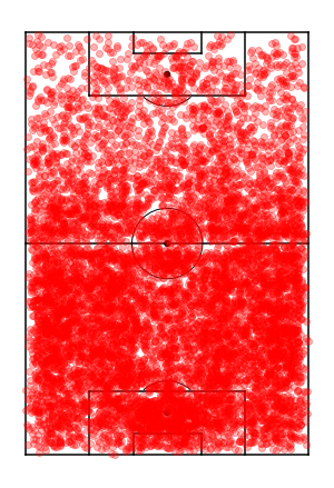
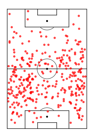
Looking at all defensive events from Arsenal across the season leads to an overplotting mess. There are so many defensive events that it’s hard to see any clear trends apart from there are fewer higher up the pitch.
(<Figure size 360x720 with 1 Axes>,
<matplotlib.axes._subplots.AxesSubplot at 0x252f5c342e8>)
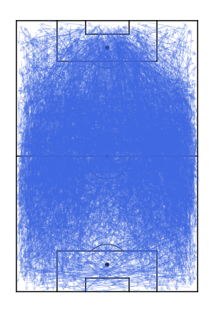
Looking at all of the opponent’s ball progressions is just as difficult to understand, there are lots of progressions in the middle and down the wide areas.
(<Figure size 360x720 with 1 Axes>,
<matplotlib.axes._subplots.AxesSubplot at 0x2528fd6d978>)
Data Visualisation
Defensive Events
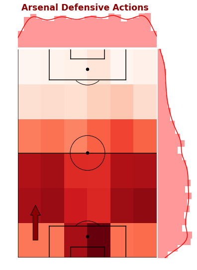
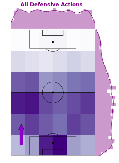
To better understand and explore Arsenal’s defensive events, the below plot is a combination of a 2D histogram grid and marginal density plots across each axis. We can see that the frequency of defensive actions is evenly spread left to right and more heavily skewed to their own half.
More specifically, the highest action areas are in front of their own goal and out wide in the full back areas above the penalty area. Defensive actions in their own penalty area are expected as that the closest to your goal and crosses into the box are dealt with.
The full back areas seem to be more proactive in making defensive actions before the opponent gets closer to the byline. Passes and cutbacks from these areas close to the byline and penalty are usually generate high quality shooting chances, so minimising the opponents ability to get here is great.
In [17]:
# Arsenal Defensive Events Density Gridfig,ax,ax_histx,ax_histy=plot_sb_event_grid_density_pitch(arsenal_defensive_actions)# Titlefig.suptitle("Arsenal Defensive Actions",x=0.5,y=0.92,fontsize='xx-large',fontweight='bold',color='darkred')# Direction of play arrowax.annotate("",xy=(10,30),xycoords='data',xytext=(10,10),textcoords='data',arrowprops=dict(width=10,headwidth=20,headlength=20,edgecolor='black',facecolor='darkred',connectionstyle="arc3"))
Out[17]:
Text(10, 10, '')
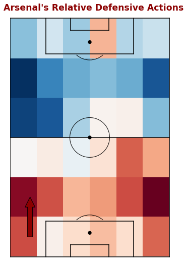
We can also take a look at the relative difference between Arsenal’s defensive events and the overall view. This density grid shows where Arsenal had more events than overall in red and less than overall in blue.
The darkest red areas are again the full back areas, suggesting that Arsenal’s full backs performed more on-ball defensive actions than their opponents. Whereas they defended their penalty area about as evenly as opponents and less frequently in their opponent’s half.
By taking a look at opponent’s ball progressions we can get potentially see the opponent’s point of view here. Do Arsenal’s full back areas have so many defensive events because they are ‘funneling’ their opponents there as they see it as a strength or do Arsenal’s opponents target and exploit their full back areas?
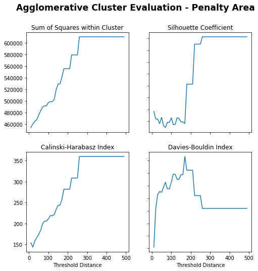
Across each third of the pitch, both KMeans and Agglomerative clustering methods were used. To identify the optimal number of clusters (Kmeans) and distance threshold (Agglomerative), a range of clusters and distance thresholds were used and evaluated across the specified metrics. The optimal number and distance thresholds were used to create clusters and visualise, there is a full example using own third progressions and results from remaining thirds below.
Own Third
In [20]:
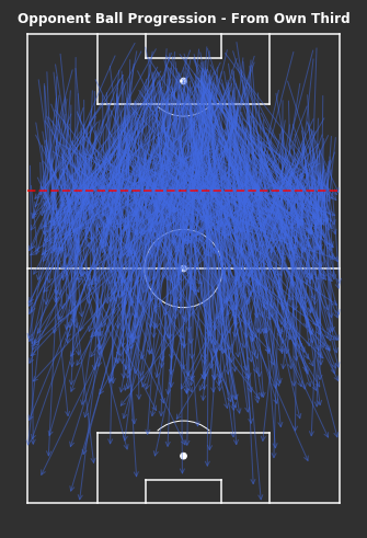
# From Own Third - Ball Progressionsfig,ax=plot_sb_events(from_own_third_opp,alpha=0.5,figsize=(5,10),pitch_theme='dark')# Set figure colour to dark themefig.set_facecolor("#303030")# Titleax.set_title("Opponent Ball Progression - From Own Third",fontdict=dict(fontsize=12,fontweight='bold',color='white'),pad=-10)# Dotted red line for own thirdax.hlines(y=80,xmin=0,xmax=80,color='red',alpha=0.7,linewidth=2,linestyle='--',zorder=5)plt.tight_layout()
K-Means
In [21]:
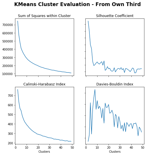
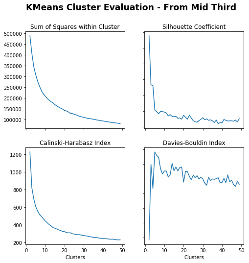
# Create cluster evaluation dataframe for up to 50 clustersown_third_clusters_kmeans=cluster_evaluation(from_own_third_opp,method='kmeans',max_clusters=50)# Plot cluster evaluation metrics by cluster numbertitle="KMeans Cluster Evaluation - From Own Third"fig,axs=plot_cluster_evaluation(own_third_clusters_kmeans)fig.suptitle(title,fontsize='xx-large',fontweight='bold')
Out[21]:
Text(0.5, 0.98, 'KMeans Cluster Evaluation - From Own Third')
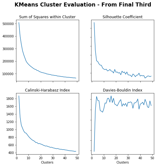
Sum of Squares (Lower) – More clusters gives lower sum of squares.
Silhouette Coefficient (Higher) – Less clusters gives higher coefficient, under 5 especially and drops around 15.
Calinski-Harabasz Index (Higher) – Less clusters gives higher index.
Davies-Bouldin Index (Lower) – Max just less than 10
Just less than 10 seems appropriate.
In [53]:
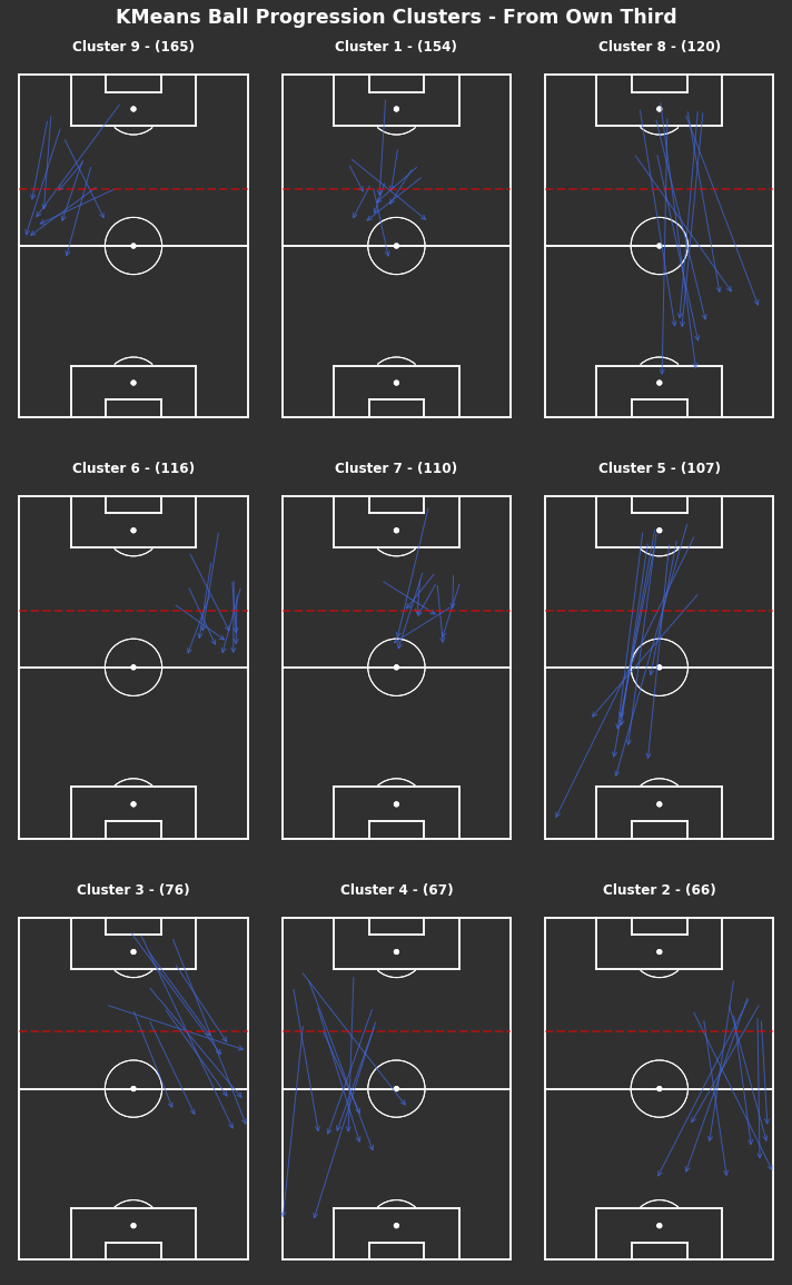
np.random.seed(1000)# KMeans based on chosen number of clusterscluster_labels_own_third=kmeans_cluster(from_own_third_opp,9)print("There are {} clusters".format(len(np.unique(cluster_labels_own_third))))# Plot each clustertitle="KMeans Ball Progression Clusters - From Own Third"fig,axs=plot_individual_cluster_events(3,3,from_own_third_opp,cluster_labels_own_third,sample_size=10)# Titlefig.suptitle(title,fontsize='xx-large',fontweight='bold',color='white',x=0.5,y=1.01)# Dotted red lines for own third across all axesforaxinaxs.flatten():ax.hlines(y=80,xmin=0,xmax=80,color='red',alpha=0.5,linewidth=2,linestyle='--',zorder=5)
There are 9 clusters
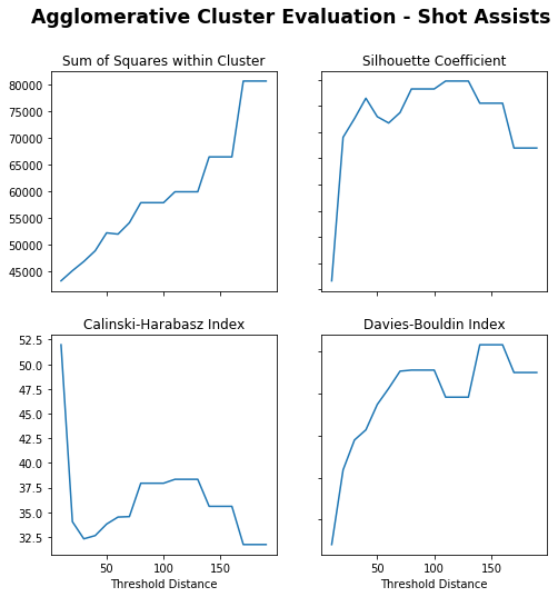
Agglomerative Clustering
In [23]:
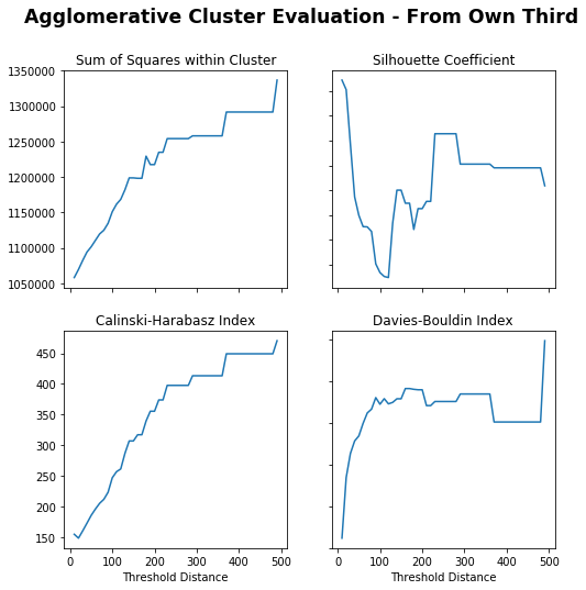
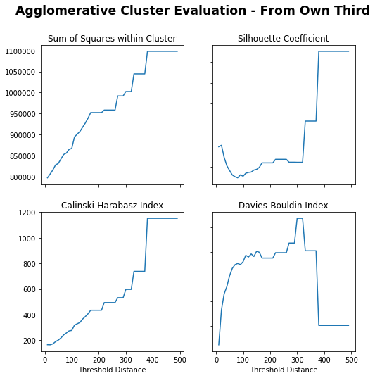
# Create cluster evaluation dataframe for up to 300 distance thresholdown_third_clusters_agglo=cluster_evaluation(from_own_third_opp,method='agglomerative',min_distance=10,max_distance=500)# Plot cluster evaluation metrics by cluster numbertitle="Agglomerative Cluster Evaluation - From Own Third"fig,axs=plot_cluster_evaluation(own_third_clusters_agglo,method='agglomerative')fig.suptitle(title,fontsize='xx-large',fontweight='bold')
Out[23]:
Text(0.5, 0.98, 'Agglomerative Cluster Evaluation - From Own Third')
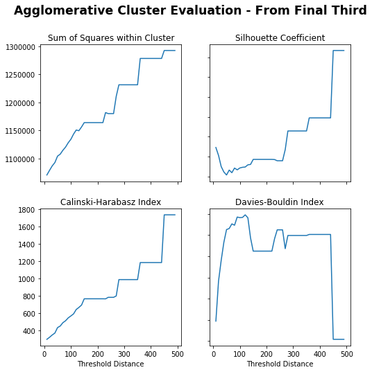
Sum of Squares (Lower) – Lower distance gives lower sum of squares, flat from 200 and sharp increase at 350.
Silhouette Coefficient (Higher) – Really low distance or peaks again at around 250.
Calinski-Harabasz Index (Higher) – Higher distance gives higher index.
Davies-Bouldin Index (Lower) – Really low distance or dips again at 350.
250 is chosen as it appears to peak for Silhouette Coefficient with others trading off.
In [48]:
np.random.seed(1000)# Agglomerative Clustering based on chosen distance thresholdcluster_labels_agglo_own_third=agglomerative_cluster(from_own_third_opp,250)print("There are {} clusters".format(len(np.unique(cluster_labels_agglo_own_third))))# Plot each clustertitle="Agglomerative Ball Progression Clusters - From Own Third"fig,axs=plot_individual_cluster_events(2,3,from_own_third_opp,cluster_labels_agglo_own_third,figsize=(10,10))# Titlefig.suptitle(title,fontsize='xx-large',fontweight='bold',color='white',x=0.5,y=1.01)# Dotted red lines for own third across all axesforaxinaxs.flatten():ax.hlines(y=80,xmin=0,xmax=80,color='red',alpha=0.5,linewidth=2,linestyle='--',zorder=5)
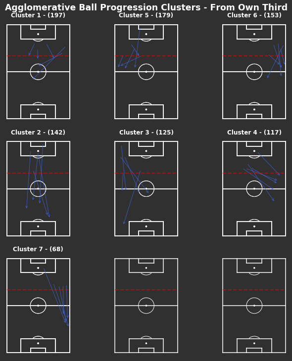
There are 7 clusters
There are less clusters than the KMeans method. They seem to be more weighted towards the end location, as in clusters 1, 5 and 6 all end just inside the middle third in the centre, left and right side respectively. Whilst the remaining clusters all end closer to the opposite half.
The remaining thirds all underwent the same evaluation process and KMeans produced more appropriate groupings across the board. Agglomerative clustering focused on the end locations when grouping and grouped according to a structured grid which wasn’t the point of this exercise.
Middle Third
In [27]:
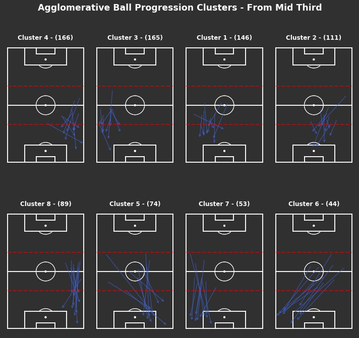
np.random.seed(1000)# KMeans based on chosen number of clusterscluster_labels_mid_third=kmeans_cluster(from_mid_third_opp,9)print("There are {} clusters".format(len(np.unique(cluster_labels_mid_third))))# Clustered Ball Progressions - From Mid Thirdfig,axs=plot_individual_cluster_events(3,3,from_mid_third_opp,cluster_labels_mid_third)# Titlefig.suptitle("KMeans Ball Progression Clusters - From Middle Third",fontsize='xx-large',fontweight='bold',color='white',x=0.5,y=1.01)# Dotted red lines for middle third across all axesforaxinaxs.flatten():ax.hlines(y=[40,80],xmin=0,xmax=80,color='red',alpha=0.5,linewidth=2,linestyle='--',zorder=5)
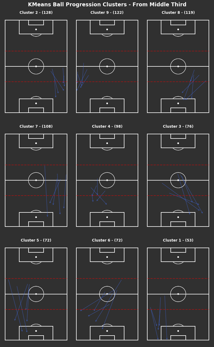
There are 9 clusters
Similar to the progressions from their own third, the most frequent progressions from the middle third are shorter down the wide areas in clusters 2 and 9, with some longer progressions in clusters 7 and 5. Clusters 8 and 4 suggest a number of progressions do make it into the centre of Arsenal’s own half.
Final Third
In [32]:
np.random.seed(1000)# KMeans based on chosen number of clusterscluster_labels_final_third=kmeans_cluster(from_final_third_opp,9)print("There are {} clusters".format(len(np.unique(cluster_labels_final_third))))# Clustered Ball Progressions - From Mid Thirdfig,axs=plot_individual_cluster_events(3,3,from_final_third_opp,cluster_labels_final_third,sample_size=10)# Titlefig.suptitle("KMeans Ball Progression Clusters - From Final Third",fontsize='xx-large',fontweight='bold',color='white',x=0.5,y=1.01)# Dotted red lines for middle third across all axesforaxinaxs.flatten():ax.hlines(y=[40,80],xmin=0,xmax=80,color='red',alpha=0.5,linewidth=2,linestyle='--',zorder=5)
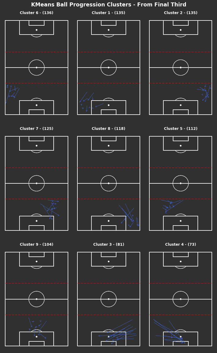
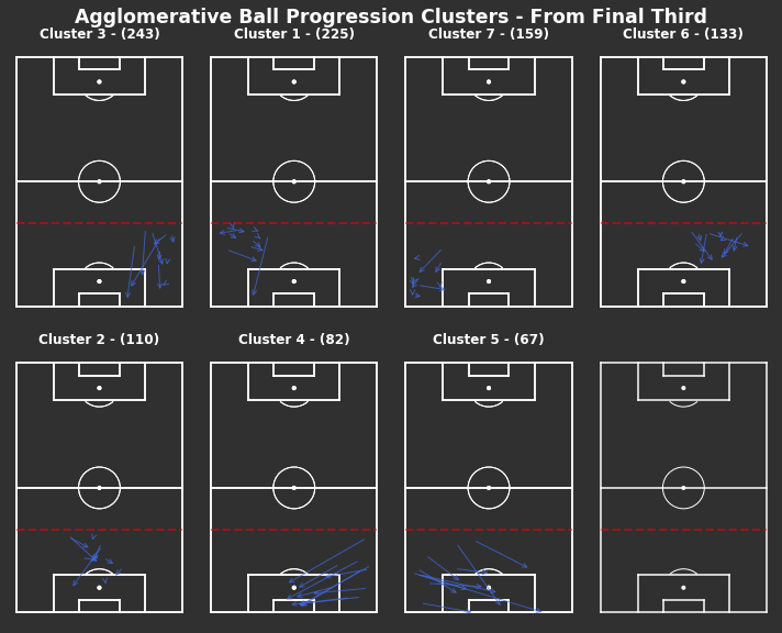
There are 9 clusters
Lots of short progressions in wide full back areas in the final third. The lowest two frequent clusters appear to be deep crosses into the penalty area, these are the only consistent progressions into the penalty area.
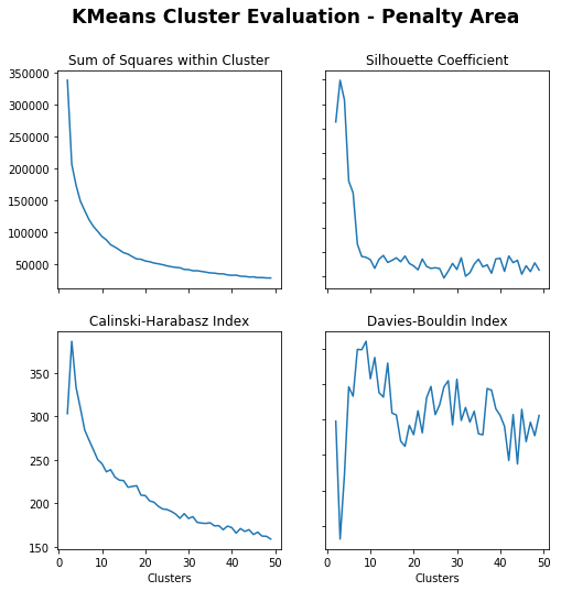
Penalty Area
In [37]:
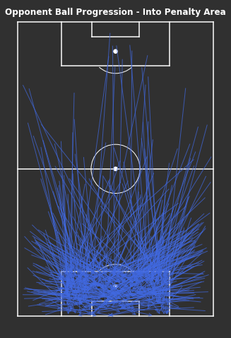
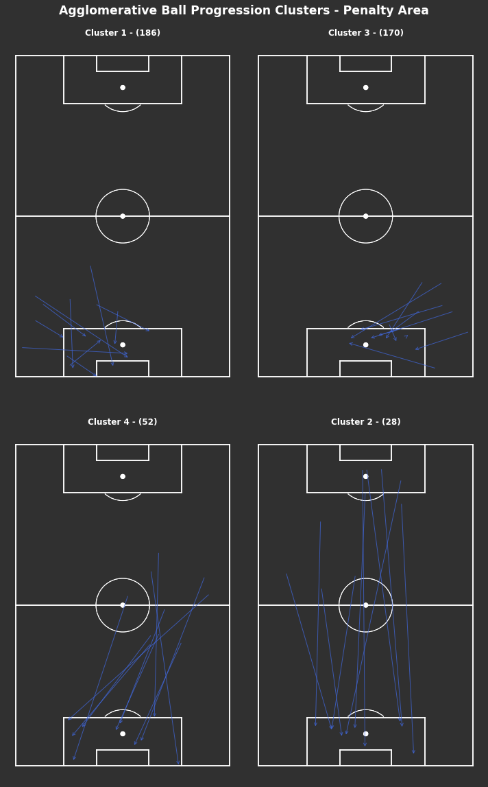
np.random.seed(1000)# KMeans based on chosen number of clusterscluster_labels_pen_area=kmeans_cluster(into_pen_area_opp,4)print("There are {} clusters".format(len(np.unique(cluster_labels_pen_area))))# Plot individual clustersfig,axs=plot_individual_cluster_events(2,2,into_pen_area_opp,cluster_labels_pen_area,sample_size=10)# Titlefig.suptitle("KMeans Ball Progression Clusters - Into Penalty Area",fontsize='xx-large',fontweight='bold',color='white',x=0.5,y=1.01)
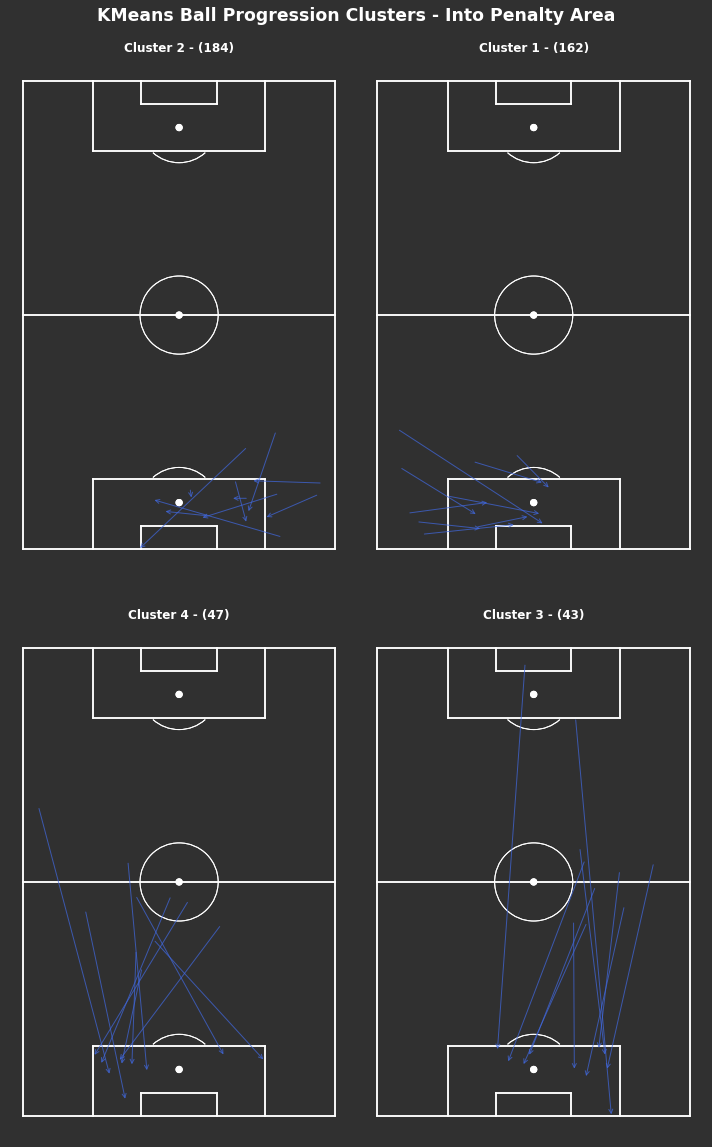
There are 4 clusters
Out[37]:
Text(0.5, 1.01, 'KMeans Ball Progression Clusters - Into Penalty Area')
There is a smaller number of clusters selected here, grouping the clusters into broader groups. These seem to be split longer and shorter, and from each wide area.
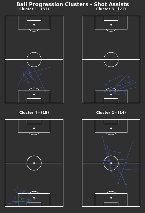
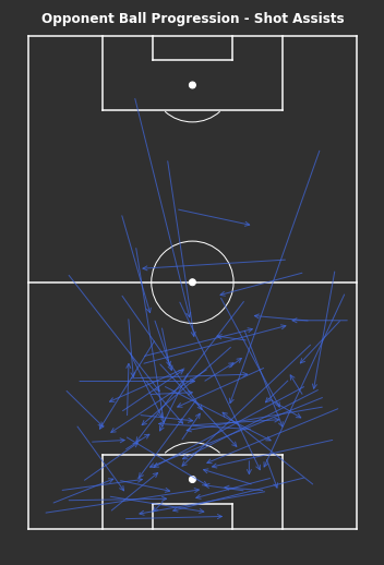
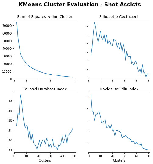
Shot Assists
In [42]:
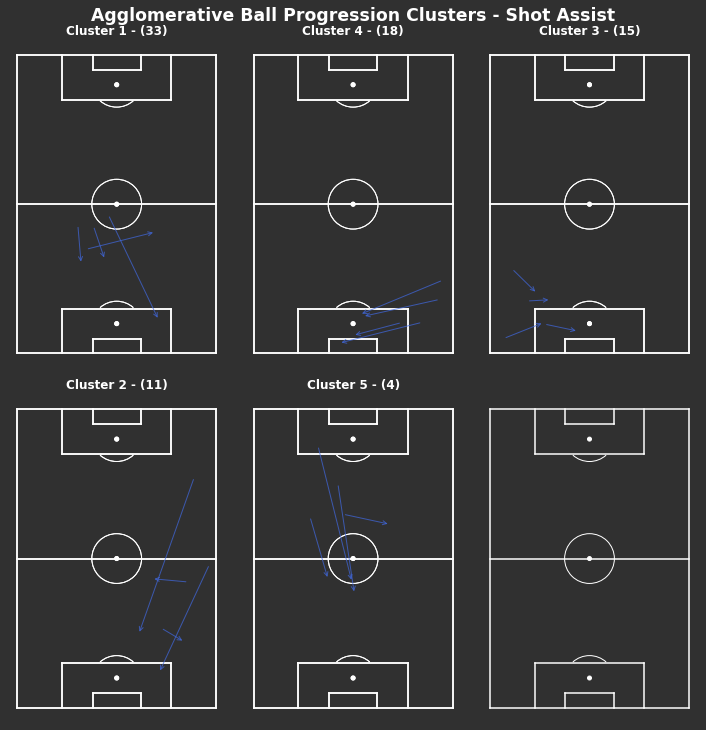
np.random.seed(1000)# KMeans based on chosen number of clusterscluster_labels_shot_assist=kmeans_cluster(opponent_shot_assists,4)print("There are {} clusters".format(len(np.unique(cluster_labels_shot_assist))))# Clustered Ball Progressions - Shot Assists fig,axs=plot_individual_cluster_events(2,2,opponent_shot_assists,cluster_labels_shot_assist,figsize=(8,10),sample_size=10)# Titlefig.suptitle("KMeans Ball Progression Clusters - Shot Assists",fontsize='xx-large',fontweight='bold',color='white',x=0.5,y=1.01)
When looking at only shot assists, there are lots from the left full back area as well as passes through the middle. Both of these are areas where if you can complete a pass towards goal then there is a higher chance of generating a shot. However, shot assists that do not penetrate the penalty area suggest that those shots are likely from further out and of lower quality.
Conclusion
Both KMeans and agglomerative clustering produced similar number of clusters after evaluation and reasonable groupings after visualisation. The k-means clusters appear to align trajectories of progression from start to end locations fairly well. From the samples in the visualisations there are consistent start and end locations within cluster. Unlike agglomerative clusters there doesn’t seem to be a pattern to cluster groupings. The agglomerative clusters appeared to be more heavily weighted to the end locations of progressions, this means that lots of the clusters were grouped into grids primarily focused on where they ended up. The aim of using clustering approaches was to try to find patterns that weren’t readily available to a human analyst, so in this sense the agglomerative clustering didn’t add anything extra.
There is no indication as to the quality of these shots produced and there is no context to compare to the wider league. But what is promising is that there is nothing significant standing out and and the common breaches of the Arsenal defence are just good progressions if they do come off. It’s not clear here how many more of these types of opportunities that were prevented due to defensive plays off the ball.
Across ball progressions throughout the whole pitch, the most frequent were shorter and in the wide areas. This is expected as shorter progressions are lower risk and wide areas are less important to defend, so are areas the defending team are willing to concede.
The length of progressions from the middle third appear to be longer than in their own third or in the final third. Context is needed in all individual circumstances but this may be due to a lower risk of failure due to being further away from your own goal or trying to take advantage of a short window of opportunity to quickly progress the ball longer distances into the final third.
When in the final third, the progressions shorten again. This is not due to lower risk, but likely due to a more densely populated area. There will be the majority of all players on the pitch within a single half of the pitch, navigating through there requires precision and patience from the offensive team.
Any completed progression into the penalty area is a success for the offensive team. There is a high chance you will create a shot and if you do it’s likely to be a higher quality shot than from outside the penalty area. Though not all completed progressions into the penalty area are created equal. If it’s a completed carry into the penalty area then awesome, you likely have the ball under control and can get a pretty good shot or extra pass. If it’s a completed pass then it depends how the player receives it, aerially or on the ground makes a difference to the shot quality. Aerial passes are harder to control and headers are of less quality than shots with the feet, however aerial passes are usually easier to complete into the penalty area. So higher quantity, lower quantity than ground passes or carries.
Shot assists rely on there being a shot at the end of them. So circularly they created a shot so are ‘good’ progressions but also they are ‘good’ progressions because they created a shot. As we can see, they are much more random which means it’s harder to understand without context why they created shooting opportunities since the locations alone don’t tell us anything. Although the context is available within StatsBomb’s data, I haven’t taken a further look here.
When considering how these progressions affect Arsenal’s defensive events, remember that the majority of their defensive events were performed out wide in the full back areas and in their own penalty area. Particularly out wide in the full back areas more than other teams, whilst defensive events within their own penalty area around the same as other teams.
At each third of the pitch, the most frequent ball progressions were out wide, which places the ball frequently in the full back areas. Due to the nature of defensive events, the only events recorded would be the on-ball actions that were defined including pressures, ball recoveries, tackles etc. The ball needs to be close to you to be able to perform these actions and get them recorded as events, so the opponent ball progression frequently going out wide combined with Arsenal’s defensive events in their defensive wide positions fits together well.
What this doesn’t tell us is if these are causally linked or just correlate. I would suggest there are more ball progressions made out wide than centrally in all of football due to the defence more likely willing to concede that space, so this doesn’t necessarily tell us much about Arsenal specifically. Though in Arsenal’s matches, they do perform defensive events in their full back areas more than other teams, which may suggest that there is something more than just correlations.
If it is a specified game plan to funnel the ball out wide and perform defensive events there, then Arsenal have done a great job at completing that. It’s a robust defensive plan if you can get it to work, the wider the ball is, the harder it is to score immediately from there. When defending it’s often useful to utilise the ends of the pitch as an ‘extra’ defender, which makes it easier to overwhelm offensive players.
Improvements
Next time I would definitely be more narrow and specific with the question I set out to answer. There was no set acceptance criteria for whether or not the results that were produced were sufficient to understand the question. This led to the mre descriptive, exploratory nature of the project and ended up scratching the surface rather than delving deeper into solving a specific problem.
Another useful tool would be to get access to tracking level data for these matches. For defensive analysis there is much more emphasis on off-ball events and distances between all the players on the pitch, tracking data would provide the locations of all players on the pitch and the ball at all times. This would provide much greater detail but also be much more complicated to work with.
Reflection
I set out to try to understand why Arsenal’s defense worked so well during their unbeaten season. Using StatsBomb’s event data for the majority of the season, I analysed where Arsenal’s defensive events were performed and how that compared to their opponents. This could only tell part of the story since defensive events only cover on-ball actions. It is accepted that defensive actions cover a whole lot more than just on-ball actions so further analysis was needed. I analysed how their opponents progressed the ball up the pitch form each third and how they created shots by clustering the locations to identify most frequent types of progressions. Considering both sides, it’s clear that much of Arsenal’s defensive work happens in their full back areas and their opponents try to progress the ball down the flanks. What is not clear is if Arsenal are causing this to happen via off the ball actions or if it’s just coincidence.
I found it hard to directly answer the question that I set out to, that’s likely due to a poor question in being too broad. However, I definitely am further along the road than when I started and has been interesting trying to work through these problems.
It was great working with event level data and trying to find interesting ways to communicate visualisations, hopefully the plots combined with the football pitches work well to add to understanding.
Arsenal’s Invincibles season is unique to the Premier League, they are the only team that has gone a complete 38 game season without losing (as been achieved in other leagues). They’re considered to be one of the best teams ever to play in the Premier League. Going a whole season without losing suggests they were at least decent at defending, to reduce or completely remove bad luck from ruining their perfect record. This post aims to look into how Arsenal’s defence managed this.
Using StatsBomb’s public event data for the Arsenal 03/04 season* (33 games), I take a look at where Arsenal’s defensive actions take place and how opponents attempted to progress the ball and create chances against them. Find these here:
Event data records all on-ball actions from a match, this is more granular than high level team and player totals. For offensive events such as passing and shooting, event data is great since they are usually on-ball actions. There are on-ball defensive actions such as tackles, interceptions and recoveries which are well captured by event data, these are the defensive events that I will be using.
We can see where these events frequently occur on the pitch for Arsenal compared to their opposition. The key nuance is that just because these are the defensive events recorded, doesn’t mean they are all of the defensive plays that take place on the pitch. The hard part about defensive analysis is that a large proportion of defending are non-events and won’t be captured by event data.
Event data still provides insight by using a combination of the defensive events from Arsenal and the offensive events from Arsenal’s opponents. Arsenal’s defensive events will show where their on-ball defending took place. Arsenal’s opponents’ offensive events will show how they approached attacking Arsenal, this may be the offensive team getting their way or Arsenal’s defence forcing opponents to play in a certain way. From Arsenal’s success, the majority of the time it’s the latter.
The below plot is a combination of a 2D histogram grid and marginal distribution plots across each axis. We can see that the frequency of defensive actions is evenly spread left to right and more heavily skewed to their own half.
More specifically, the highest action areas are in front of their own goal and out wide in the full back areas above the penalty area. Defensive actions in their own penalty area are expected as that the closest to your goal and crosses into the box are dealt with.
The full back areas seem to be more proactive in making defensive actions before the opponent gets closer to the byline. Passes and cutbacks from these areas close to the byline and penalty are usually generate high quality shooting chances, so minimising the opponents ability to get here is great.
Figure 1: Marginal Distribution Plot of Arsenal’s Defensive Events
The below density grid compares Arsenal’s defensive events relative to all defensive events in their games. Where Arsenal had more events than overall is in red and less than overall in blue. The darkest red areas are again the full back areas, suggesting that Arsenal’s full backs performed more on-ball defensive actions than their opponents. Whereas they defended their penalty area about as evenly as opponents and less frequently in their opponent’s half.
Figure 2: 2D Histogram of Arsenal’s events relative to all defensive events
Opponent’s Ball Progressions
By taking a look at opponent’s ball progressions we can see the opponent’s point of view here. Do Arsenal’s full back areas have so many defensive events because they are ‘funneling’ their opponents there as they see it as a strength or do Arsenal’s opponents target and exploit their full back areas?
These progressions have been grouped into approximate phases of play through the thirds and into the penalty area.
The progressions have been grouped into similar types of progressions by comparing KMeans and Agglomerative Clustering methods. Reassuringly there were similar number of clusters from both methods, but the KMeans method appeared to perform better by grouping similar passes at both start and end locations. Further details can be found here: https://github.com/ciaran-grant/StatsBomb-Invincibles
Own Third
Figure 3: Clusters of opponent’s ball progressions from their own third
We find that the most frequent ball progressions from their own third are shorter progressions into the middle third. There are short progressions centrally in clusters 1 and 7, with wider progressions in clusters 9 and 6. Longer progressions were less frequent.
Shorter progressions are easier to complete and less risky, so not surprising that they are the most frequent. This says nothing for how quality or sustainable these progressions are, but adds to the idea that most of the play appears to be out wide.
Middle Third
Figure 4: Clusters of opponent’s ball progressions from the middle third
Similar to the progressions from their own third, the most frequent progressions from the middle third are shorter down the wide areas in clusters 2 and 9, with some longer progressions in clusters 7 and 5. Clusters 8 and 4 suggest a number of progressions do make it into the centre of Arsenal’s own half.
Final Third
Figure 5: Clusters of opponent’s ball progressions from their final third
Again, lots of short progressions in wide full back areas in the final third seen in clusters 6 and 2. The lowest two frequent clusters appear to be deep crosses into the penalty area. These are the only consistent progressions into the penalty area, but usually create lower quality chances through headers or contested shots.
Penalty Area
Figure 6: Clusters of opponent’s ball progressions into Arsenal’s penalty area
There are fewer groups here due to fewer progressions into the penalty area, which is expected. There are more progressions from each wide area, with a large proportion coming from much shorter progressions in clusters 2 and 1. It’s more difficult to successfully progress the ball long distances into the penalty area. The few clusters here are pretty broadly grouped, intuitively human analysts could create these groupings pretty quickly which suggests the clustering hasn’t helped much here.
Shot Assists
Figure 7: Clusters of opponent’s shot assists
When looking at only shot assists, there are lots that are received outside the penalty area. This suggests that those shots are likely from further out and of lower quality without context. Due to the added restriction of requiring a shot at the end of these passes, there is likely more variance included in these passes and harder to identify clear patterns.
Takeaways
Across ball progressions throughout the whole pitch, the most frequent were shorter and in the wide areas. This is expected as shorter progressions are lower risk and wide areas are less important to defend, so are areas the defending team are willing to concede.
The length of progressions from the middle third appear to be longer than in their own third or in the final third. Context is needed in all individual circumstances but this may be due to a lower risk of failure due to being further away from your own goal or trying to take advantage of a short window of opportunity to quickly progress the ball longer distances into the final third.
When in the final third, the progressions shorten again. This is not due to lower risk, but likely due to a more densely populated area. There will be the majority of all players on the pitch within a single half of the pitch, navigating through there requires precision and patience from the offensive team.
Any completed progression into the penalty area is a success for the offensive team. There is a high chance you will create a shot and if you do it’s likely to be a higher quality shot than from outside the penalty area. Though not all completed progressions into the penalty area are created equal. If it’s a completed carry into the penalty area then awesome, you likely have the ball under control and can get a pretty good shot or extra pass. If it’s a completed pass then it depends how the player receives it, aerially or on the ground makes a difference to the shot quality. Aerial passes are harder to control and headers are of less quality than shots with the feet, however aerial passes are usually easier to complete into the penalty area. So higher quantity, lower quantity than ground passes or carries.
Shot assists rely on there being a shot at the end of them. So circularly they created a shot so are ‘good’ progressions but also they are ‘good’ progressions because they created a shot. As we can see, they are much more random which means it’s harder to understand without context why they created shooting opportunities since the locations alone don’t tell us anything. Although the context is available within StatsBomb’s data, I haven’t taken a further look here.
When considering how these progressions affect Arsenal’s defensive events, remember that the majority of their defensive events were performed out wide in the full back areas and in their own penalty area. Particularly out wide in the full back areas more than other teams, whilst defensive events within their own penalty area around the same as other teams.
At each third of the pitch, the most frequent ball progressions were out wide, which places the ball frequently in the full back areas. Due to the nature of defensive events, the only events recorded would be the on-ball actions that were defined including pressures, ball recoveries, tackles etc. The ball needs to be close to you to be able to perform these actions and get them recorded as events, so the opponent ball progression frequently going out wide combined with Arsenal’s defensive events in their defensive wide positions fits together well.
What this doesn’t tell us is if these are causally linked or just correlate. I would suggest there are more ball progressions made out wide than centrally in all of football due to the defence more likely willing to concede that space, so this doesn’t necessarily tell us much about Arsenal specifically. Though in Arsenal’s matches, they do perform defensive events in their full back areas more than other teams, which may suggest that there is something more than just correlations.
If it is a specified game plan to funnel the ball out wide and perform defensive events there, then Arsenal have done a great job at completing that. It’s a robust defensive plan if you can get it to work, the wider the ball is, the harder it is to score immediately from there. When defending it’s often useful to utilise the ends of the pitch as an ‘extra’ defender, which makes it easier to overwhelm offensive players.
Arsenal’s Invincibles season is unique to the Premier League, they are the only team that has gone a complete 38 game season without losing. They’re considered to be one of the best teams ever to play in the Premier League. Going a whole season without losing suggests they were at least decent at defending, to reduce or completely remove bad luck from ruining their perfect record. This project aims to look into how Arsenal’s defence managed this.
Using StatsBomb’s public event data for the Arsenal 03/04 season* (33 games), I take a look at where Arsenal’s defensive actions take place and how opponents attempted to progress the ball and create chances against them.
Problem Statement
The goal is to identify areas of Arsenal’s defensive strengths and the frequent approaches used by opponents. Tasks involved are as follows:
Download and preprocess StatsBomb’s event data
Explore and visualise Arsenal’s defensive actions
Explore and visualise Opponent’s ball progression by thirds
Cluster and evaluate Opponent’s ball progressions
Cluster and evaluate Opponent’s shot creations
Metrics
A major problem when using many clustering algorithms is identifying how many clusters exist in the data since they require that as an input parameter. Sometimes expert judgement can provide a good estimate. However, some clustering algorithms such as agglomerative clustering require other inputs such as distance thresholds to determine clusters.
When using k-means clustering, to determine the number of clusters the following metrics are used. When using agglomerative clustering, to determine the distance threshold the same metrics are used. They try to consider the density of points within clusters and between clusters.
Sum of squares within cluster:
Calculated using the inertia_ attribute of the k-means class, to compute the sum of squared distances of samples to their closest cluster center. Lower scores for more dense clusters.
Known as the Variance Ratio Criterion, defined as the ratio between within-cluster dispersion and between-cluster dispersion. Higher scores signal clusters are dense and well separated.
Average similarity measure of each cluster with its most similar cluster, where similarity is the ratio of within-cluster distances to between-cluster distances. Minimum score is 0, lower values for better clusters.
StatsBomb collect event data for lots of football matches and have made freely available a selection of matches (including all FAWSL) to allow amateur projects to be able to take place. All they ask is to sign up to their StatsBomb Public Data User Agreement here: https://statsbomb.com/academy/. And get access to the data via their GitHub here: https://github.com/statsbomb/open-data
Their data is stored in json files, with the event data for each match identifiable by their match ids. To get the relevant match ids, you can find those in the matches.json file. To get the relevant season and competitions, you can find that in the competitions.json file.
In [2]:
# Load competitions to find correct season and league codeswithopen('open-data-master/data/competitions.json')asf:competitions=json.load(f)competitions_df=pd.DataFrame(competitions)competitions_df[competitions_df['competition_name']=='Premier League']# Arsenal Invincibles Seasonwithopen('open-data-master/data/matches/2/44.json',encoding='utf-8')asf:matches=json.load(f)# Find match idsmatches_df=json_normalize(matches,sep="_")match_id_list=matches_df['match_id']# Load events for match idsarsenal_events=pd.DataFrame()formatch_idinmatch_id_list:withopen('open-data-master/data/events/'+str(match_id)+'.json',encoding='utf-8')asf:events=json.load(f)events_df=json_normalize(events,sep="_")events_df['match_id']=match_idevents_df=events_df.merge(matches_df[['match_id','away_team_away_team_name','away_score','home_team_home_team_name','home_score']],on='match_id',how='left')arsenal_events=arsenal_events.append(events_df)print('Number of matches: '+str(len(match_id_list)))
The coordinates are mapped to a horizontal pitch with the origin (0, 0) in the top left corner, and (120, 80) in the bottom right. Since I am interested in defensive analysis from the point of view of Arsenal, I thought it would be easier to interpret if we converted these to a vertical pitch with Arsenal defending from the bottom and the opposition attacking downwards.
The location tuples for start and pass_end, carry_end are separated. They are all rotated to fit vertical pitch and then I create a universal end location for all progression events.
In [3]:
# Separate locations into x, yarsenal_events[['location_x','location_y']]=arsenal_events['location'].apply(pd.Series)arsenal_events[['pass_end_location_x','pass_end_location_y']]=arsenal_events['pass_end_location'].apply(pd.Series)arsenal_events[['carry_end_location_x','carry_end_location_y']]=arsenal_events['carry_end_location'].apply(pd.Series)# Create vertical locationsarsenal_events['vertical_location_x']=80-arsenal_events['location_y']arsenal_events['vertical_location_y']=arsenal_events['location_x']arsenal_events['vertical_pass_end_location_x']=80-arsenal_events['pass_end_location_y']arsenal_events['vertical_pass_end_location_y']=arsenal_events['pass_end_location_x']arsenal_events['vertical_carry_end_location_x']=80-arsenal_events['carry_end_location_y']arsenal_events['vertical_carry_end_location_y']=arsenal_events['carry_end_location_x']# Create universal end locations for event typearsenal_events['end_location_x']=np.where(arsenal_events['type_name']=='Pass',arsenal_events['pass_end_location_x'],np.where(arsenal_events['type_name']=='Carry',arsenal_events['carry_end_location_x'],np.nan))arsenal_events['end_location_y']=np.where(arsenal_events['type_name']=='Pass',arsenal_events['pass_end_location_y'],np.where(arsenal_events['type_name']=='Carry',arsenal_events['carry_end_location_y'],np.nan))arsenal_events['vertical_end_location_x']=np.where(arsenal_events['type_name']=='Pass',arsenal_events['vertical_pass_end_location_x'],np.where(arsenal_events['type_name']=='Carry',arsenal_events['vertical_carry_end_location_x'],np.nan))arsenal_events['vertical_end_location_y']=np.where(arsenal_events['type_name']=='Pass',arsenal_events['vertical_pass_end_location_y'],np.where(arsenal_events['type_name']=='Carry',arsenal_events['vertical_carry_end_location_y'],np.nan))
As we are only interested in defensive events, we need to define the list of those. The full list of available events is located in the events documentation above.
I have defined all defensive events to use throughout below and filtered all events for those. Due to the nature of event data, these are all on-ball defensive actions. Often defensive plays are off-ball and explicitly deny future events from taking place, so these events may only highlight the end point of a potential sequence of ‘invisible’ defensive plays.
Since event data cannot tell the full defensive story, taking a look at the opposition’s offensive plays may help.
Firstly I remove all set pieces in favour of keeping only open play progressions. This is because defending from open play and set pieces requires different approaches, I will be focusing on open play progressions here.
Need to define what event types we class as ball progressions too. Here I have defined passes, carries and dribbles. The difference between a Carry and a Dribble is that a Dribble is ‘an attempt by a player to beat an opponent’, whilst a Carry is defined as ‘a player controls the ball at their feet while moving or standing still.’ In the data this distinction is clearer since a Carry has a start and end point, whilst a Dribble starts and ends in the same place.
The defined list of ball progression columns were aspirational and things I think would be useful to consider for next time, but didn’t get to look further into.
As mentioned above, when using the vertical pitch it would be useful to have the opponents moving in the opposite direction to the defending team (Arsenal) to feel more interpretable when visualising.
I have separated the ball progressions into thirds on the pitch since different approaches may be taken in different areas of the pitch. More caution would be expected closer to your own goal than in the opponents third.
Narrowing down more towards goal threatening progressions I’ve separated out passes and carries into the penalty area and shot assists.
Finally, dribbles are considered separately since they don’t have a separate end location. There is more focus on the progressions via passes and carries since they have quantifiable start to end progressions up the pitch.
In [5]:
# Remove Set Piecesopen_play_patterns=['Regular Play','From Counter','From Keeper']arsenal_open_play=arsenal_events[arsenal_events['play_pattern_name'].isin(open_play_patterns)]# Define Opponents Ball Progressionevent_types=['Pass','Carry','Dribble']ball_progression_cols=['id','player_name','period','possession','duration','type_name','possession_team_name','team_name','play_pattern_name','vertical_location_x','vertical_location_y','vertical_end_location_x','vertical_end_location_y','pass_length','pass_angle','pass_height_name','pass_body_part_name','pass_type_name','pass_outcome_name','ball_receipt_outcome_name','pass_switch','pass_technique_name','pass_cross','pass_through_ball','pass_shot_assist','shot_statsbomb_xg','pass_goal_assist','pass_cut_back','under_pressure']# Filter Opponents and Ball Progression Columnsopponent_ball_progressions=arsenal_open_play[(arsenal_open_play['team_name']!='Arsenal')&(arsenal_open_play['type_name'].isin(event_types))]opponent_ball_progressions=opponent_ball_progressions[ball_progression_cols]# Reverse locations for opponentsopponent_ball_progressions['vertical_location_x']=80-opponent_ball_progressions['vertical_location_x']opponent_ball_progressions['vertical_location_y']=120-opponent_ball_progressions['vertical_location_y']opponent_ball_progressions['vertical_end_location_x']=80-opponent_ball_progressions['vertical_end_location_x']opponent_ball_progressions['vertical_end_location_y']=120-opponent_ball_progressions['vertical_end_location_y']# Separate events into thirds, penalty areafrom_own_third_opp,from_mid_third_opp,from_final_third_opp,into_pen_area_opp= \
ball_progression_events_into_thirds(opponent_ball_progressions)# Filter shot assistsopponent_shot_assists=opponent_ball_progressions[opponent_ball_progressions['pass_shot_assist']==True]# Filter dribblesopponent_dribbles=opponent_ball_progressions[opponent_ball_progressions['type_name']=='Dribble']
Data Exploration
This is an incredible sparse dataset, there are lots of events and lots of categorical columns to provide much needed context. Most columns aren’t applicable to most events so there are lots of missing or uninteresting values.
There are lots more progressions via Passes than Carries in the opposition’s own third and middle third. This is likely due to the reduced risk of a forward pass compared to a carry. If you lose the ball due to a misplaced pass, the ball is likely higher up the field and the passer is closer to their own goal as an extra defender. If you lose the ball due to being tackled, then you likely lose the ball from where you are and are chasing back to catch up.
In the final third, there is a much more even split between Carries and Passes. Perhaps due to forward passing becoming much harder the further up the pitch and the reduced risk of Carries since you are so far away from your own goal.
(<Figure size 360x720 with 1 Axes>,
<matplotlib.axes._subplots.AxesSubplot at 0x2528fd6d978>)
Due to the lower volume, we can actually see that there are more dribbles out wide than centrally.
In [16]:
plot_sb_event_location(opponent_dribbles)
Out[16]:
(<Figure size 360x720 with 1 Axes>,
<matplotlib.axes._subplots.AxesSubplot at 0x25298c82be0>)
Methodology
Event data records all on-ball actions from a match, this is more granular than high level team and player totals. As well as the event types, the event locations and extra information for the respective event type are recorded to provide context where possible. For offensive events such as passing and shooting, event data is great since they are usually on-ball actions. There are on-ball defensive actions such as tackles, interceptions and recoveries which are well captured by event data, these are the defensive events that I will be using. Using these defensive events, we can see where these events frequently occur on the pitch for Arsenal compared to their opposition. The key nuance is that just because these are the defensive events recorded, doesn’t mean they are all of the defensive plays that take place on the pitch.
The hard part about defensive analysis is that a large proportion of defending are non-events and won’t be captured by event data. If an opportunity to pass the ball to your striker is removed due to a defensive player blocking the passing lane, that pass will not happen and will not be recorded as such. The effective defensive play was to deny a potential event taking place for the offensive team.
Using event data to evaluate defenses can be done by using a combination of the defensive events from Arsenal and the offensive actions from Arsenal’s opponents. Arsenal’s defensive events will show where their on-ball defending took place. Arsenal’s opponents’ offensive events will show how they approached attacking Arsenal, this may be the offensive team getting their way or Arsenal’s defence forcing opponents to play in a certain way. From Arsenal’s success, the majority of the time it’s the latter.
To look at Arsenal’s defensive events, I plot the defensive events in a gridded 2D histogram across the pitch with marginal density plots along each axis to highlight areas of high activity. The same is done for Arsenal’s opponents and the differences can be highlighted using the ratio.
To look at Arsenal’s opponents events, I specifically look at ball progression including passes, carries and dribbles. These are separated into similar locations on the pitch since different approaches will be required:
From their own third forwards
From the middle third forwards
From the final third forwards
Into the penalty area
Shot assists
These categories of ball progressions are clustered using K-Means and Agglomerative Clustering on the start and end locations to group similar ball progressions for each area of the pitch. The assumed number of clusters is decided using expert judgement and four evaluation measures:
Sum of squared variance within cluster
Silhouette Coefficient
Calinski-Harabasz Index
Davies-Bouldin Index
These clusters will represent the approaches that opponents tried to attack and create chances against Arsenal. No concrete results will be able to be drawn from only this, but they will give a better understanding.
Implementation
Defensive Events
In [17]:
# Arsenal Defensive Events Density Gridfig,ax,ax_histx,ax_histy=plot_sb_event_grid_density_pitch(arsenal_defensive_actions)# Titlefig.suptitle("Arsenal Defensive Actions",x=0.5,y=0.92,fontsize='xx-large',fontweight='bold',color='darkred')# Direction of play arrowax.annotate("",xy=(10,30),xycoords='data',xytext=(10,10),textcoords='data',arrowprops=dict(width=10,headwidth=20,headlength=20,edgecolor='black',facecolor='darkred',connectionstyle="arc3"))
Out[17]:
Text(10, 10, '')
Rather than the overplotting mess we saw above, the above plot is a combination of a 2D histogram grid and marginal density plots across each axis. We can see that the frequency of defensive actions is evenly spread left to right and more heavily skewed to their own half.
More specifically, the highest action areas are in front of their own goal and out wide in the full back areas above the penalty area. Defensive actions in their own penalty area are expected as that the closest to your goal and crosses into the box are dealt with.
The full back areas seem to be more proactive in making defensive actions before the opponent gets closer to the byline. Passes and cutbacks from these areas close to the byline and penalty are usually generate high quality shooting chances, so minimising the opponents ability to get here is great.
In [18]:
# All Defensive Events Density Gridfig,ax,ax_histx,ax_histy=plot_sb_event_grid_density_pitch(defensive_actions,grid_colour_map='Purples',bar_colour='purple')# Titlefig.suptitle("All Defensive Actions",x=0.5,y=0.92,fontsize='xx-large',fontweight='bold',color='purple')# Direction of play arrowax.annotate("",xy=(10,30),xycoords='data',xytext=(10,10),textcoords='data',arrowprops=dict(width=10,headwidth=20,headlength=20,edgecolor='black',facecolor='darkviolet',connectionstyle="arc3"))
Out[18]:
Text(10, 10, '')
Here we have all defensive events across the matches that Arsenal were in, so Arsenal will be a major contributor to these frequencies. It’s interesting to see the events still largely take place in their own penalty area, but less so in the full back areas.
Whilst seeing all defensive events gave some insight into what everyone was doing overall, we can also take a look at the relative difference between Arsenal’s defensive events and the overall view. This density grid shows where Arsenal had more events than overall in red and less than overall in blue.
The darkest red areas are again the full back areas, suggesting that Arsenal’s full backs performed more on-ball defensive actions than their opponents. Whereas they defended their penalty area about as evenly as opponents and less frequently in their opponent’s half.
Refinement
By taking a look at opponent’s ball progressions we can get potentially see the opponent’s point of view here. Do Arsenal’s full back areas have so many defensive events because they are ‘funneling’ their opponents there as they see it as a strength or do Arsenal’s opponents target and exploit their full back areas?
Ball Progression – Own Third
In [20]:
# From Own Third - Ball Progressionsfig,ax=plot_sb_events(from_own_third_opp,alpha=0.5,figsize=(5,10),pitch_theme='dark')# Set figure colour to dark themefig.set_facecolor("#303030")# Titleax.set_title("Opponent Ball Progression - From Own Third",fontdict=dict(fontsize=12,fontweight='bold',color='white'),pad=-10)# Dotted red line for own thirdax.hlines(y=80,xmin=0,xmax=80,color='red',alpha=0.7,linewidth=2,linestyle='--',zorder=5)plt.tight_layout()
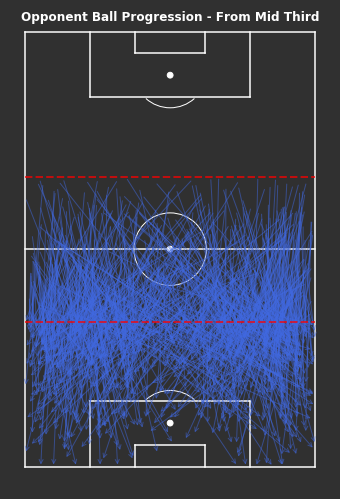
Even whilst only looking at the ball progressions from their own third, it’s still hard to identify any trends or patterns of play. There are lots of longer passes, though I have only included progressions of at least 10 yards.
K-Means
In [21]:
# Create cluster evaluation dataframe for up to 50 clustersown_third_clusters_kmeans=cluster_evaluation(from_own_third_opp,method='kmeans',max_clusters=50)# Plot cluster evaluation metrics by cluster numbertitle="KMeans Cluster Evaluation - From Own Third"fig,axs=plot_cluster_evaluation(own_third_clusters_kmeans)fig.suptitle(title,fontsize='xx-large',fontweight='bold')
Out[21]:
Text(0.5, 0.98, 'KMeans Cluster Evaluation - From Own Third')
Sum of Squares (Lower) – More clusters gives lower sum of squares.
Silhouette Coefficient (Higher) – Less clusters gives higher coefficient, under 5 especially and drops around 15.
Calinski-Harabasz Index (Higher) – Less clusters gives higher index.
Davies-Bouldin Index (Lower) – Max just less than 10
Just less than 10 seems appropriate.
In [53]:
np.random.seed(1000)# KMeans based on chosen number of clusterscluster_labels_own_third=kmeans_cluster(from_own_third_opp,9)print("There are {} clusters".format(len(np.unique(cluster_labels_own_third))))# Plot each clustertitle="KMeans Ball Progression Clusters - From Own Third"fig,axs=plot_individual_cluster_events(3,3,from_own_third_opp,cluster_labels_own_third,sample_size=10)# Titlefig.suptitle(title,fontsize='xx-large',fontweight='bold',color='white',x=0.5,y=1.01)# Dotted red lines for own third across all axesforaxinaxs.flatten():ax.hlines(y=80,xmin=0,xmax=80,color='red',alpha=0.5,linewidth=2,linestyle='--',zorder=5)
There are 9 clusters
We find that the most frequent cluster types for progressing the ball from their own third are shorter progressions into the middle third. There are short progressions centrally in clusters 10 and 17, with wider progressions in clusters 4 and 7.
Shorter progressions are easier to complete and less risky, so not surprising that they are the most frequent. This says nothing for how quality or sustainable these progressions are.
Agglomerative Clustering
In [23]:
# Create cluster evaluation dataframe for up to 300 distance thresholdown_third_clusters_agglo=cluster_evaluation(from_own_third_opp,method='agglomerative',min_distance=10,max_distance=500)# Plot cluster evaluation metrics by cluster numbertitle="Agglomerative Cluster Evaluation - From Own Third"fig,axs=plot_cluster_evaluation(own_third_clusters_agglo,method='agglomerative')fig.suptitle(title,fontsize='xx-large',fontweight='bold')
Out[23]:
Text(0.5, 0.98, 'Agglomerative Cluster Evaluation - From Own Third')
Sum of Squares (Lower) – Lower distance gives lower sum of squares, flat from 200 and sharp increase at 350.
Silhouette Coefficient (Higher) – Really low distance or peaks again at around 250.
Calinski-Harabasz Index (Higher) – Higher distance gives higher index.
Davies-Bouldin Index (Lower) – Really low distance or dips again at 350.
250 is chosen as it appears to peak for Silhouette Coefficient with others trading off.
In [48]:
np.random.seed(1000)# Agglomerative Clustering based on chosen distance thresholdcluster_labels_agglo_own_third=agglomerative_cluster(from_own_third_opp,250)print("There are {} clusters".format(len(np.unique(cluster_labels_agglo_own_third))))# Plot each clustertitle="Agglomerative Ball Progression Clusters - From Own Third"fig,axs=plot_individual_cluster_events(2,3,from_own_third_opp,cluster_labels_agglo_own_third,figsize=(10,10))# Titlefig.suptitle(title,fontsize='xx-large',fontweight='bold',color='white',x=0.5,y=1.01)# Dotted red lines for own third across all axesforaxinaxs.flatten():ax.hlines(y=80,xmin=0,xmax=80,color='red',alpha=0.5,linewidth=2,linestyle='--',zorder=5)
There are 7 clusters
There are less clusters than the KMeans method. They seem to be more weighted towards the end location, as in clusters 1, 5 and 6 all end just inside the middle third in the centre, left and right side respectively. Whilst the remaining clusters all end closer to the opposite half.
Ball Progression – Middle Third
In [25]:
# From Mid Third - Ball Progressionsfig,ax=plot_sb_events(from_mid_third_opp,alpha=0.5,figsize=(5,10),pitch_theme='dark')# Set figure colour to dark themefig.set_facecolor("#303030")# Titleax.set_title("Opponent Ball Progression - From Mid Third",fontdict=dict(fontsize=12,fontweight='bold',color='white'),pad=-10)# Dotted red lines for middle thirdax.hlines(y=[40,80],xmin=0,xmax=80,color='red',alpha=0.7,linewidth=2,linestyle='--',zorder=5)fig.tight_layout()
Ball progressions from the middle third seem to have trajectories that are more dense out wide, so the ball rarely travels through the middle of the pitch in Arsenal’s own third. This may be another indicator that the ball is being directed outside, likely because there are lots of players located centrally.
KMeans
In [26]:
# Create cluster evaluation dataframe for up to 50 clustersmid_third_clusters_kmeans=cluster_evaluation(from_mid_third_opp,method='kmeans',max_clusters=50)# Plot cluster evaluation metrics by cluster numbertitle="KMeans Cluster Evaluation - From Mid Third"fig,axs=plot_cluster_evaluation(mid_third_clusters_kmeans)fig.suptitle(title,fontsize='xx-large',fontweight='bold')
Out[26]:
Text(0.5, 0.98, 'KMeans Cluster Evaluation - From Mid Third')
Sum of Squares (Lower) – More clusters, the lower the error.
Silhouette Coefficient (Higher) – After settling, the peak seems just less than 10.
Calinski-Harabasz Index (Higher) – Less clusters, the higher the index.
Davies-Bouldin Index (Lower) – After settling, the more clusters the lower the index, with a drop around 10.
To balance 1 and 3, whilst satisfying both 2 and 4, 9 clusters seems appropriate.
In [27]:
np.random.seed(1000)# KMeans based on chosen number of clusterscluster_labels_mid_third=kmeans_cluster(from_mid_third_opp,9)print("There are {} clusters".format(len(np.unique(cluster_labels_mid_third))))# Clustered Ball Progressions - From Mid Thirdfig,axs=plot_individual_cluster_events(3,3,from_mid_third_opp,cluster_labels_mid_third)# Titlefig.suptitle("KMeans Ball Progression Clusters - From Middle Third",fontsize='xx-large',fontweight='bold',color='white',x=0.5,y=1.01)# Dotted red lines for middle third across all axesforaxinaxs.flatten():ax.hlines(y=[40,80],xmin=0,xmax=80,color='red',alpha=0.5,linewidth=2,linestyle='--',zorder=5)
There are 9 clusters
Similar to the progressions from their own third, the most frequent progressions from the middle third are shorter down the wide areas in clusters 2 and 9, with some longer progressions in clusters 7 and 5. Clusters 8 and 4 suggest a number of progressions do make it into the centre of Arsenal’s own half.
Agglomerative
In [28]:
# Create cluster evaluation dataframe for up to 300 distance thresholdown_mid_clusters_agglo=cluster_evaluation(from_mid_third_opp,method='agglomerative',min_distance=10,max_distance=500)print("There are {} passes.".format(from_mid_third_opp.shape[0]))# Plot cluster evaluation metrics by cluster numbertitle="Agglomerative Cluster Evaluation - From Own Third"fig,axs=plot_cluster_evaluation(own_mid_clusters_agglo,method='agglomerative')fig.suptitle(title,fontsize='xx-large',fontweight='bold')
There are 848 passes.
Out[28]:
Text(0.5, 0.98, 'Agglomerative Cluster Evaluation - From Own Third')
Sum of Squares (Lower) – Lower distance means lower error, flatten at 200 and jumps at 300.
Calinski-Harabasz Index (Higher) – Higher distance gives higher index, spikes at 300+.
Davies-Bouldin Index (Lower) – Bottom of the curve seems to be around 200.
300+ is likely not producing sensible results due to constant error across the board. 200 seems to be reasonable everywhere.
In [29]:
np.random.seed(1000)# Agglomerative Clustering based on chosen distance thresholdcluster_labels_agglo_mid_third=agglomerative_cluster(from_mid_third_opp,200)print("There are {} clusters".format(len(np.unique(cluster_labels_agglo_mid_third))))# Plot each clustertitle="Agglomerative Ball Progression Clusters - From Mid Third"fig,axs=plot_individual_cluster_events(2,4,from_mid_third_opp,cluster_labels_agglo_mid_third,figsize=(10,10),sample_size=10)# Titlefig.suptitle(title,fontsize='xx-large',fontweight='bold',color='white',x=0.5,y=1.01)# Dotted red lines for own third across all axesforaxinaxs.flatten():ax.hlines(y=[40,80],xmin=0,xmax=80,color='red',alpha=0.5,linewidth=2,linestyle='--',zorder=5)
There are 8 clusters
There are similar number of clusters found across both methods. Agglomerative clustering again seems to more heavily weight the end locations heavier than the start locations. Lots of shorter progressions just into the final third and especially in wider areas such as clusters 4 and 3.
It has also found clusters entering the half space just outside the Arsenal penalty are in clusters 1 and 2 which is interesting. These 8 clusters seem to form 2 row x 8 column grid of end locations.
Ball Progression – Final Third
In [30]:
# From Final Third - Ball Progressionsfig,ax=plot_sb_events(from_final_third_opp,alpha=0.5,figsize=(5,10),pitch_theme='dark')# Set figure colour to dark themefig.set_facecolor("#303030")# Titleax.set_title("Opponent Ball Progression - From Final Third",fontdict=dict(fontsize=12,fontweight='bold',color='white'),pad=-10)# Dotted red line for final thirdax.hlines(y=40,xmin=0,xmax=80,color='red',alpha=0.7,linewidth=2,linestyle='--',zorder=5)fig.tight_layout()
Once in the final third, the progressions are less vertically direct. Hard to tell here, but looks like lots of shorter progressions and longer direct progressions into the box, likely crosses.
KMeans
In [31]:
# Create cluster evaluation dataframe for up to 50 clustersfinal_third_clusters_kmeans=cluster_evaluation(from_final_third_opp,method='kmeans',max_clusters=50)print("There are {} passes.".format(from_final_third_opp.shape[0]))# Plot cluster evaluation metrics by cluster numbertitle="KMeans Cluster Evaluation - From Final Third"fig,axs=plot_cluster_evaluation(final_third_clusters_kmeans)fig.suptitle(title,fontsize='xx-large',fontweight='bold')
There are 1019 passes.
Out[31]:
Text(0.5, 0.98, 'KMeans Cluster Evaluation - From Final Third')
Sum of Squares (Lower) – More clusters gives lower error.
Silhouette Coefficient (Higher) – Less clusters gives higher coefficient.
Calinski-Harabasz Index (Higher) – Less clusters gives higher coefficient
Davies-Bouldin Index (Lower) – Drop just before 10 looks optimal.
Just before 10 is only clear sign, so have chosen 9.
In [32]:
np.random.seed(1000)# KMeans based on chosen number of clusterscluster_labels_final_third=kmeans_cluster(from_final_third_opp,9)print("There are {} clusters".format(len(np.unique(cluster_labels_final_third))))# Clustered Ball Progressions - From Mid Thirdfig,axs=plot_individual_cluster_events(3,3,from_final_third_opp,cluster_labels_final_third,sample_size=10)# Titlefig.suptitle("KMeans Ball Progression Clusters - From Final Third",fontsize='xx-large',fontweight='bold',color='white',x=0.5,y=1.01)# Dotted red lines for middle third across all axesforaxinaxs.flatten():ax.hlines(y=[40,80],xmin=0,xmax=80,color='red',alpha=0.5,linewidth=2,linestyle='--',zorder=5)
There are 9 clusters
Lots of short progressions in wide full back areas in the final third. The lowest two frequent clusters appear to be deep crosses into the penalty area, these are the only consistent progressions into the penalty area.
Agglomerative
In [33]:
# Create cluster evaluation dataframe for up to 300 distance thresholdown_final_clusters_agglo=cluster_evaluation(from_final_third_opp,method='agglomerative',min_distance=10,max_distance=500)print("There are {} passes.".format(from_final_third_opp.shape[0]))# Plot cluster evaluation metrics by cluster numbertitle="Agglomerative Cluster Evaluation - From Final Third"fig,axs=plot_cluster_evaluation(own_final_clusters_agglo,method='agglomerative')fig.suptitle(title,fontsize='xx-large',fontweight='bold')
There are 1019 passes.
Out[33]:
Text(0.5, 0.98, 'Agglomerative Cluster Evaluation - From Final Third')
Sum of Squares (Lower) – Lower distance gives lower error, spikes at 250.
Calinski-Harabasz Index (Higher) – Higher distance gives higher index, spikes at 250.
Davies-Bouldin Index (Lower) – Optimal looks around 150-250
250 seems appropriate across all.
In [47]:
np.random.seed(1000)# Agglomerative Clustering based on chosen distance thresholdcluster_labels_agglo_final_third=agglomerative_cluster(from_final_third_opp,250)print("There are {} clusters".format(len(np.unique(cluster_labels_agglo_final_third))))# Plot each clustertitle="Agglomerative Ball Progression Clusters - From Final Third"fig,axs=plot_individual_cluster_events(2,4,from_final_third_opp,cluster_labels_agglo_final_third,figsize=(10,8),sample_size=10)# Titlefig.suptitle(title,fontsize='xx-large',fontweight='bold',color='white',x=0.5,y=1.01)# Dotted red lines for own third across all axesforaxinaxs.flatten():ax.hlines(y=40,xmin=0,xmax=80,color='red',alpha=0.5,linewidth=2,linestyle='--',zorder=5)
There are 7 clusters
Again there are a similar number of clusters selected, with lots of progressions short and in wide areas. The least frequent again appear to be deep wide crosses into the penalty area and are the only consistent penalty area entry.
Ball Progression – Penalty Area
In [35]:
# Into Penalty Area - Ball Progressionsfig,ax=plot_sb_events(into_pen_area_opp,alpha=0.7,figsize=(5,10),pitch_theme='dark')# Set figure colour to dark themefig.set_facecolor("#303030")# Titleax.set_title("Opponent Ball Progression - Into Penalty Area",fontdict=dict(fontsize=12,fontweight='bold',color='white'),pad=-10)fig.tight_layout()
The majority of progressions into the penalty area come from out wide, however there are some that are incredibly direct and even from their own half.
KMeans
In [36]:
# Create cluster evaluation dataframe for up to 50 clusterspen_area_clusters_kmeans=cluster_evaluation(into_pen_area_opp,method='kmeans',max_clusters=50)print("There are {} passes.".format(into_pen_area_opp.shape[0]))# Plot cluster evaluation metrics by cluster numbertitle="KMeans Cluster Evaluation - Penalty Area"fig,axs=plot_cluster_evaluation(pen_area_clusters_kmeans)fig.suptitle(title,fontsize='xx-large',fontweight='bold')
Sum of Squares (Lower) – More clusters the lower the error.
Silhouette Coefficient (Higher) – Very high coefficient below 5 clusters.
Calinski-Harabasz Index (Higher) – Less clusters the higher the index.
Davies-Bouldin Index (Lower) – Very low index below 5 clusters.
Peak Silhouette coefficient matches minimum DB Index at 4 here.
In [37]:
np.random.seed(1000)# KMeans based on chosen number of clusterscluster_labels_pen_area=kmeans_cluster(into_pen_area_opp,4)print("There are {} clusters".format(len(np.unique(cluster_labels_pen_area))))# Plot individual clustersfig,axs=plot_individual_cluster_events(2,2,into_pen_area_opp,cluster_labels_pen_area,sample_size=10)# Titlefig.suptitle("KMeans Ball Progression Clusters - Into Penalty Area",fontsize='xx-large',fontweight='bold',color='white',x=0.5,y=1.01)
There are 4 clusters
Out[37]:
Text(0.5, 1.01, 'KMeans Ball Progression Clusters - Into Penalty Area')
There is a smaller number of clusters selected here, grouping the clusters into broader groups. These seem to be split longer and shorter, and from each wide area. This doesn’t really help us.
Agglomerative
In [38]:
# Create cluster evaluation dataframe for up to 300 distance thresholdpen_area_clusters_agglo=cluster_evaluation(into_pen_area_opp,method='agglomerative',min_distance=10,max_distance=500)print("There are {} passes.".format(into_pen_area_opp.shape[0]))# Plot cluster evaluation metrics by cluster numbertitle="Agglomerative Cluster Evaluation - Penalty Area"fig,axs=plot_cluster_evaluation(pen_area_clusters_agglo,method='agglomerative')fig.suptitle(title,fontsize='xx-large',fontweight='bold')
Appropriate distance again gives 4 clusters which groups progressions very broadly into short or long and from left or right.
Ball Progression – Shot Assists
In [40]:
# Shot Assistfig,ax=plot_sb_events(opponent_shot_assists,pitch_theme='dark')# Set figure colour to dark themefig.set_facecolor("#303030")# Titleax.set_title("Opponent Ball Progression - Shot Assists",fontdict=dict(fontsize=12,fontweight='bold',color='white'),pad=-10)fig.tight_layout()
Shot assists seem to be largely random, the criteria of having a shot attached to the end of the pass is incredible strict and contextual to other players.
KMeans
In [41]:
# Create cluster evaluation dataframe for up to 50 clustersshot_assist_clusters_kmeans=cluster_evaluation(opponent_shot_assists,method='kmeans',max_clusters=50)print("There are {} passes.".format(opponent_shot_assists.shape[0]))# Plot cluster evaluation metrics by cluster numbertitle="KMeans Cluster Evaluation - Shot Assists"fig,axs=plot_cluster_evaluation(shot_assist_clusters_kmeans)fig.suptitle(title,fontsize='xx-large',fontweight='bold')
Sum of Squares (Lower) – More clusters gives lower error.
Silhouette Coefficient (Higher) – Peak is at 4.
Calinski-Harabasz Index (Higher) – Peak is at 4.
Davies-Bouldin Index (Lower) – More clusters gives lower error, sharp drop around 5.
4 seems to be optimal for Silhouette COefficient and CH index.
In [42]:
np.random.seed(1000)# KMeans based on chosen number of clusterscluster_labels_shot_assist=kmeans_cluster(opponent_shot_assists,4)print("There are {} clusters".format(len(np.unique(cluster_labels_shot_assist))))# Clustered Ball Progressions - Shot Assists fig,axs=plot_individual_cluster_events(2,2,opponent_shot_assists,cluster_labels_shot_assist,figsize=(8,10),sample_size=10)# Titlefig.suptitle("Ball Progression Clusters - Shot Assists",fontsize='xx-large',fontweight='bold',color='white',x=0.5,y=1.01)
When looking at only shot assists, there are lots from the left full back area as well as passes through the middle. Both of these are areas where if you can complete a pass towards goal then there is a higher chance of generating a shot. However, shot assists that do not penetrate the penalty area suggest that those shots are likely from further out and of lower quality.
Agglomerative
In [43]:
# Create cluster evaluation dataframe for up to 300 distance thresholdshot_assist_clusters_agglo=cluster_evaluation(opponent_shot_assists,method='agglomerative',min_distance=10,max_distance=200)# 200 max_distance chosen here as lower distance between all samples and few samples.# Plot cluster evaluation metrics by cluster numbertitle="Agglomerative Cluster Evaluation - Shot Assists"fig,axs=plot_cluster_evaluation(shot_assist_clusters_agglo,method='agglomerative')fig.suptitle(title,fontsize='xx-large',fontweight='bold')
Small number of clusters makes sense due to fewer progressions. Some of clusters which have end locations far away from the penalty area such as clusters 1 and 4, these are both central and require context to understand how players found shooting opportunities from here. Likely to be counter attacks with minimal defenders between them and the goal.
Results
Both KMeans and agglomerative clustering produced similar number of clusters after evaluation and reasonable groupings after visualisation.
The k-means clusters appear to align trajectories of progression from start to end locations fairly well. From the samples in the visualisations there are consistent start and end locations within cluster. Unlike agglomerative clusters there doesn’t seem to be a pattern to cluster groupings.
The agglomerative clusters appeared to be more heavily weighted to the end locations of progressions, this means that lots of the clusters were grouped into grids primarily focused on where they ended up. The aim of using clustering approaches was to try to find patterns that weren’t readily available to a human analyst, so in this sense the agglomerative clustering didn’t add anything extra.
There is no indication as to the quality of these shots produced and there is no context to compare to the wider league. But what is promising is that there is nothing significant standing out and and the common breaches of the Arsenal defence are just good progressions if they do come off. It’s not clear here how many more of these types of opportunities that were prevented due to defensive plays off the ball.
Justification
Opponent’s Ball Progressions
Across ball progressions throughout the whole pitch, the most frequent were shorter and in the wide areas. This is expected as shorter progressions are lower risk and wide areas are less important to defend, so are areas the defending team are willing to concede.
The length of progressions from the middle third appear to be longer than in their own third or in the final third. Context is needed in all individual circumstances but this may be due to a lower risk of failure due to being further away from your own goal or trying to take advantage of a short window of opportunity to quickly progress the ball longer distances into the final third.
When in the final third, the progressions shorten again. This is not due to lower risk, but likely due to a more densely populated area. There will be the majority of all players on the pitch within a single half of the pitch, navigating through there requires precision and patience from the offensive team.
Any completed progression into the penalty area is a success for the offensive team. There is a high chance you will create a shot and if you do it’s likely to be a higher quality shot than from outside the penalty area. Though not all completed progressions into the penalty area are created equal. If it’s a completed carry into the penalty area then awesome, you likely have the ball under control and can get a pretty good shot or extra pass. If it’s a completed pass then it depends how the player receives it, aerially or on the ground makes a difference to the shot quality. Aerial passes are harder to control and headers are of less quality than shots with the feet, however aerial passes are usually easier to complete into the penalty area. So higher quantity, lower quantity than ground passes or carries.
Shot assists rely on there being a shot at the end of them. So circularly they created a shot so are ‘good’ progressions but also they are ‘good’ progressions because they created a shot. As we can see, they are much more random which means it’s harder to understand without context why they created shooting opportunities since the locations alone don’t tell us anything. Although the context is available within StatsBomb’s data, I haven’t taken a further look here.
Arsenal’s Defensive Events
When considering how these progressions affect Arsenal’s defensive events, remember that the majority of their defensive events were performed out wide in the full back areas and in their own penalty area. Particularly out wide in the full back areas more than other teams, whilst defensive events within their own penalty area around the same as other teams.
At each third of the pitch, the most frequent ball progressions were out wide, which places the ball frequently in the full back areas. Due to the nature of defensive events, the only events recorded would be the on-ball actions that were defined including pressures, ball recoveries, tackles etc. The ball needs to be close to you to be able to perform these actions and get them recorded as events, so the opponent ball progression frequently going out wide combined with Arsenal’s defensive events in their defensive wide positions fits together well.
What this doesn’t tell us is if these are causally linked or just correlate. I would suggest there are more ball progressions made out wide than centrally in all of football due to the defence more likely willing to concede that space, so this doesn’t necessarily tell us much about Arsenal specifically. Though in Arsenal’s matches, they do perform defensive events in their full back areas more than other teams, which may suggest that there is something more than just correlations.
If it is a specified game plan to funnel the ball out wide and perform defensive events there, then Arsenal have done a great job at completing that. It’s a robust defensive plan if you can get it to work, the wider the ball is, the harder it is to score immediately from there. When defending it’s often useful to utilise the ends of the pitch as an ‘extra’ defender, which makes it easier to overwhelm offensive players.
Conclusion
Reflection
I set out to try to understand why Arsenal’s defense worked so well during their unbeaten season. Using StatsBomb’s event data for the majority of the season, I analysed where Arsenal’s defensive events were performed and how that compared to their opponents. This could only tell part of the story since defensive events only cover on-ball actions. It is accepted that defensive actions cover a whole lot more than just on-ball actions so further analysis was needed. I analysed how their opponents progressed the ball up the pitch form each third and how they created shots by clustering the locations to identify most frequent types of progressions. Considering both sides, it’s clear that much of Arsenal’s defensive work happens in their full back areas and their opponents try to progress the ball down the flanks. What is not clear is if Arsenal are causing this to happen via off the ball actions or if it’s just coincidence.
I found it hard to directly answer the question that I set out to, that’s likely due to a poor question in being too broad. However, I definitely am further along the road than when I started and has been interesting trying to work through these problems.
It was great working with event level data and trying to find interesting ways to communicate visualisations, hopefully the plots combined with the football pitches work well to add to understanding.
Improvement
Next time I would definitely be more narrow and specific with the question I set out to answer.
Another useful tool would be to get access to tracking level data for these matches. For defensive analysis there is much more emphasis on off-ball events and distances between all the players on the pitch, tracking data would provide the locations of all players on the pitch and the ball at all times. This would provide much greater detail but also be much more complicated to work with.
WordPress conversion from # 26 – Arsenal’s Invincibles Defence (Submission 2).ipynb by nb2wp v0.3.1
As the new 2020/21 Premier League season is about to get underway, a big question is whether Liverpool can replicate their utter dominance. They’ve won the league by an unprecedented margin, and it never really looked like anything else was going to happen. Not even Pep Guardiola’s Manchester City teams that have just achieved 100 and 98 points in the previous two years could come close, they hadn’t been able to maintain that pace for a third season. Liverpool have just had consecutive 97 and 95 point seasons, hoping to replicate that form for the upcoming third season.
It had been noted that despite winning the league in record time, Liverpool’s expected goals and goal difference was still not as good as Manchester City’s. This suggests the idea that Manchester City were in fact the better team over the course of the season and that Liverpool have been merely lucky to win the league by such a margin.
Using shot distance, shot times and expected goals from www.fbref.com, I’ve approximate expected goals per shot for both Liverpool and Manchester City’s 2019/20 Premier League season. The total expected goal totals across each match have been proportioned out using shot distance to approximate expected goals per shot. Per shot information allows expected goals and minutes aggregation by gamestate.
Gamestate is an important factor in contextualising football matches. Stronger teams usually spend more time winning a game than weaker teams. Teams that are winning are no longer under obligation to push forward as much, with the losing team responsible for trying to get back into the game.
Across both the 97 and 95 point Liverpool seasons in 2018/19 and 2019/20, Liverpool achieved the majority of their expected goals in winning gamestates. Notably in the recent 2019/20 season, they actually achieved more expected goals winning by a single goal than drawing.
Whereas for Manchester City, there is a clear distinction between their 98 point 2018/19 season and the recent 2019/20 season. They have earned a much larger proportion of their expected goals at a neutral gamestate than their title winning season, they are clearly creating the chances but perhaps have been wasteful. It’s also noticeable that they create lots of their expected goals when they’re already 3+ ahead and lots more when losing than the previous year.
Now lets take a look at how long each team has spent in each gamestate across the season.
Much like the expected goals charts, the proportion of minutes played between each club suggests a clear difference in approach that each team needed to adopt. Liverpool have spent a much larger proportion of their time winning by 1 goal, whilst Manchester City spent more time Losing and winning by 3+.
They both spent a similar proportion of time at neutral gamestates, though Manchester City’s expected goals at this gamestate were much higher. This suggests more chances and shots were required to go ahead in the game, Liverpool went ahead more efficiently and spent more time ahead at +1.
As mentioned earlier, your approach can change once you are winning. You no longer need to force anything or take risks, the responsibility to equalise or reduce the deficit is on the opponents so they need to take risks. Playing with no risks allows for a higher floor in performance, no doubt being in winning positions so much helped Liverpool maintain their momentum throughout the season. When you aren’t winning, you are required to create chances and shoot more which in turn helps build up your expected goals numbers.
Manchester City built up a lot of expected goals whilst at a neutral gamestate, when they were losing and when they were 3+ ahead. At neutral gamestates, these are the goals that convert into points most easily, and Liverpool were more efficient than Manchester City. When losing, you need to create shots (rack up expected goals numbers) to get back in the games, but you’re only losing because you didn’t score the first goal. When you’re 3+ ahead, these shots and expected goals likely won’t change the points returns of the match. Manchester City spent lots of time either needing to score goals in losing or neutral gamestates or absolutely crushing teams, and little in between, which perhaps explains their ridiculous expected goals numbers.
Liverpool spend little time and expected goals to get from neutral to +1 gamestates, meaning they could spend reduced time with responsibility to take more risks. They spent little time losing and lots of time ahead +1, with little time spent at 3+. They get ahead early and then not much else happened in the game, pretty good strategy to win. They’re deserving champions and perhaps explains why their expected goals aren’t as bonkers as Manchester City’s.
There’s so much more data available for football matches now than there ever has been. There are some fantastic initiatives making tracking and event data freely available by StatsBomb and Metrica Sports. But there’s also lots of other information more widely available out on the web at the likes of https://www.transfermarkt.co.uk/ and recently fbref.com. These won’t be as detailed match to match, but offer a wider overview of what’s happening on and off the pitch.
Accessing information from the web can be time consuming unless automated, which is made very easy using some powerful Python packages and tutorials widely available, like FCPython. There are limits to what you can/should access automatically since we don’t want to overload websites with requests. More information on scraping can be found here.
There are many public functions for web scraping different places, but advice I would give would be to try and make your own to ensure you actually understand what you’re getting. I’ll still add my own interpretation of a web scraping function which works for player/squad tables on fbref, so here’s a link to the GitHub page which has the functions I used with some examples: https://github.com/ciaran-grant/fbref_data
Progressive Passes
There are lots of types of passes available on fbref, it’s really appreciative having all this data available to explore. Here I am taking a look at progressive passes, with a view to see who’s leading the way this year and if there are any styles we can infer.
Among the progressive passes available the ones that I’ve focused on are below:
Total Progressive Distance
Number of Progressive Passes
Passes into the Final Third
Passes into the Penalty Area
Key Passes
Expected Assists
These have been chosen to try to get a cross between both quantity and quality of ball progression.
As each player has played a different number of minutes, I have used per 90 minutes to compare players. It may be more suitable to use number of minutes in possession for offensive passing such as this, and also number of minutes out of possession for defensive measures. But per 90 minutes goes most of the way there.
Each metric has a significantly different range of values, for example Total Progressive Distance per 90 minutes will be in the 100s/1000s whilst xA per 90 minutes will be between 0 and 0.5 usually. An extra 1 progressive distance is way less impressive than an extra 1 xA. To compare between statistics I’ve normalised each relative to the best performer respectively, this forces all comparisons relative to their peers at their productivity per 90 minutes.
This makes it hard to compare between different groups sometimes, but as long as you’re aware of the context what everything is relative to then that should be minimised.
On to the fun stuff!
Out of all players in the 2019/20 season it’s no surprise that two of the most complete progressive passes were: Lionel Messi and Kevin De Bruyne. We’ve passed the Messi sense-check at least.
Both are among the top across almost all statistics in both ball progression and actually creating quality chances.
There seems to be two styles that most players fit into, the above two are aliens so they don’t count. There are chance creators:
Angel Di Maria leads everyone in passes into the penalty area and xA, with lots of key passes too. These types of players seem to be great at using the ball in and around the box, converting possession into chances.
There are also deep progressors:
This is among all players, position agnostic. And David Alaba appears as the best passer into the final 3rd, whilst also high volume and distance in progressive passes. These are deeper players who can move the ball from the halfway line into the final third for your chance creators to thrive.
I have identified these personally just using some intuition, I think next steps will be to test my theory and apply some clustering or PCA to these players to try to identify more styles.
Whilst for perspective at just how good these guys are, here they are relative to everyone. They are some of the best players in the world already, pretty scary.
Designed to get a general overview of what the opposition team does well. This could be another subset of patterns of play that an opponent takes rather than just goals such as shots in the box, passes into the final 3rd, etc.
This tab shows the events and tracking data for the respective frames for all the Liverpool goals provided by Last Row.
Events – Pitch Value [Tab 2]
Designed to add context to the view of events that take place in previous tab. This will show what options were available to the player on the ball and what options the defence has covered. It can start discussions about player positioning off the ball and decisions made between events.
Pitch Value is created by adding the context of relevance (PT) and scoring opportunity (PS) to Pitch Control (PPCF) as outlined by @the_spearman.
pitch_value_model.py, generate_pitch_value, line 322
Pitch Control is also the implementation from @EightyFivePoint’s tutorials. This computes the probability that each team will control the ball in each position on the pitch, subject to interceptions, time to control the ball and player velocities.
pitch_value_model.py, lastrow_generate_pitch_control_for_event, line 259
Where relevance is computed as a normally distributed probability constrained by ball travel time and Pitch Control. Mean of 14m as per @the_spearman’s Beyond Expexted Goals, 2018
pitch_value_model.py, generate_relevance_at_event, line 270
Scoring opportunity is calculated as a normally distributed probability subject to the distance to goal.
pitch_value_model.py, generate_scoring_opportunity, line 298
Player Displacement – Pitch Value [Tab 3]
Once an area for improvement has been established, this tab will provide the opportunity to manually adjust a player’s position and get an updated view of Pitch Value. This can help to understand where players should be positioned at each event, with the consequences laid out. Reducing the Relative Pitch Control will help to prevent the opposition from scoring. Reducing their number of options will make them more predictable.
Pitch Value is as calculated from Tab 2.
Relative Pitch Value is calculated as the Pitch Value of each area divided by the Pitch Value at the current ball location for the event and frame. This shows areas which moving to will increase your Pitch Control, potentially providing suggestions for on/off ball decision making.
pitch_value_model.py, generate_relative_pitch_value, line 365
Hopefully this allows anyone who uses the app to understand how the values are computed without having to trawl through my messy code structure on GitHub.
Any further questions please do get in touch at @Ciaran_Grant or @TLMAnalytics
Lastly thanks again to all those contributing at Friends of Tracking for providing all the great content that they have been putting out. It really helps and inspires those of us who have been looking in from the outside!
Considering the suspensions of all major leagues, I thought it would be a good chance to catch up on how each one. Specifically here I’m taking a look at the distribution of minutes played by players in each team by the age of those players. The inspiration for this came from Real Sociedad and seeing that the core of their team has been a bunch of early twenty year olds and they currently sit in 4th should the leagues end now. This did seem unusual, but to compare with other teams this sparked a project that I have come across much more time to complete.
The data for this analysis has come from transfermarkt.com. Using the helpful tutorials on FC Python, specifically https://fcpython.com/scraping/introduction-scraping-data-transfermarkt, means all of the data you see is possible to get into a much cleaner, easier to use table or dataframe.
Minutes played is in all competitions during the 2019/2020 season up to the latest round of games before league suspensions.
I’ve taken a look at the top 5 European leagues and noted down some interesting, some weird and some funny things that came up.
La Liga
Age x Minutes Played in La Liga so far in 2019/2020 season
Real Sociedad
The initial inspiration for this project, so it’s nice to confirm the intuition that allocating lots of minutes to a younger group of players isn’t the norm. They have done well this year, I expect this team to have players poached sooner rather than later.
Real Madrid
What struck me with this was the gap between the core 7/8 players in their prime ages and the rest of the squad. They are always in ‘win now’ mode so it’s hard to ease in any youngsters, especially with the expectations of the last decade. But they’re going to need to start to trust a few more of the younger players they actually have an abundance of.
Atletico Madrid
In my head, Atletico’s team is full of 30+ year olds. They are all just passed their prime and have all the experience and tactical nouse a single team could contain. Then I see that the majority of their team is late 20s, actually just hitting their prime. They’ve got some kind of weird, Simeone style conveyor belt going on behind the scenes there.
Ligue 1
Age x Minutes Played in Ligue 1 so far in 2019/2020 season
Lyon/Lille
Another case of lots of minutes played by young players, not too surprising that it’s Lyon and Lille. However worth pointing out again because this is still very much out of the ordinary and some teams seem to be able to consistently do this.
Rennes
This outlier up in the top left corner is Eduardo Camavinga, born on November 2002. He’s still 17. He’s on course to play 3000 minutes this year at centre midfield. He’s pretty good.
Montpellier
This other outlier in the top right is Vitorino Hilton, born in September 1977. He’s 42. He’s on course to play 3000 minutes this year at centre back. I had never heard of him before. He’s 42 and playing 3000 minutes in Ligue 1. I have gained much respect for him.
Bundesliga
Age x Minutes Played in Bundesliga so far in 2019/2020 season
Gladback/BVB
Obligatory lots of minutes for young players alert here. No surprise from Dortmund, but Gladbach are just a notch or two below in terms of the quality and quantity of minutes they’re getting from younger players this year.
Liepzig
RB Leipzig should also be in the lots of minutes for young players, but I thought they deserved a separate mention just because they ONLY play young players. There might be a virtual barrier around the training ground which doesn’t let you in after your 30th birthday.
Paderborn
Paderborn are currently bottom of the Bundesliga and look to have generally spread the minutes around, maybe trying different players or tactics to find something that works. I haven’t watched them. But interesting that the player with most minutes played is 22 year old Sebastian Vasiliadis in centre midfield. Is he the player the coaches trust the most? Or have they had injury troubles to other key players? He could be staying in the Bundesliga next year.
Serie A
Age x Minutes Played in Serie A so far in 2019/2020 season
Juventus
If there was ever a ‘win now’ team’s age profile, it would be this one. High proportion of minutes given to age 30+ players means that surely a rebuild is coming soon. De Ligt/Demiral are probably the start of that. (Note Buffon in the bottom right skewing the x-axis for every other team.)
AC Milan
The only really negatively correlated distribution I’ve seen, lots of minutes for young and not so many minutes for old players. I’d heard that Milan had made a decision to go in a different direction than overpaying just-past-their-prime players on long contracts, seems like they’re at least giving younger guys a go.
Atalanta
Special mention here goes to the island of players in their prime that Atalanta seem to have collected together. Hopefully they have a Gasparini type conveyor belt ready to go.
Premier League
Age x Minutes Played in the Premier League so far in 2019/2020 season
Dwight Mcneil
This is probably my favourite distribution of all. And yet there is nothing actually surprising about what there is to see. Burnley are a team of all old/in their prime players, and then there’s Dwight McNeil. Come on Sean, give him someone from his own generation to talk to at least.
Wolves, Sheffield Utd don’t rotate
There’s definitely something to be said here about team understanding and having consistent line-ups. All these teams have a group of players playing the majority of their minutes, all these teams arguably perform above expectations. This may be confirmation bias as I haven’t checked the cases where core teams underperform. Wolves have played more games than the other teams in Europe, and still don’t rotate. Looking at you Conor Coady at 4000+ minutes already.
Aston Villa
The obligatory team with lots of minutes for young players is Aston Villa? They’re not especially seeing the success that other synonymous teams around Europe are having, probably due to this being mostly debut seasons all at once in a relegation fight.
That about wraps it up, if there are any interesting things you have spotted then give me a shout! Once again, this wouldn’t have been possible without starting off with getting the data from transfermarkt so huge props to FCPython and their website which does a great job. Check them out at @FC_Python.